

AssetPulse User Guide
Predictive maintenance for rotating equipment, running entirely on your Atrium gateway. Describe a machine once, point a wireless vibration sensor at it, and AssetPulse grades every capture against ISO vibration standards, flags likely defects, and can turn the evidence into a plain-language report.
01Overview
AssetPulse turns raw vibration data into maintenance decisions. You tell it what a machine is — its type, size, mounting, and running speed — and which sensor probes are measuring it. From then on every capture is graded, trended, and checked for the signatures of common faults.
02Requirements
AssetPulse needs a gateway that can request raw vibration captures from the radio, and at least one supported vibration sensor.
| Requirement | Detail |
|---|---|
| Platform version | Atrium 2.3.1 or newer. |
| Gateway model | EG5120 only. AssetPulse is not installable on the EG5100 — the App Center will say so rather than offering the install. |
| License | Required, and free during Beta. contact us to request an AssetPulse license for your gateway. |
| Sensors | One or more supported vibration sensors, listed below. |
Supported sensors
- Industrial IoT Wireless Smart Vibration Sensor (Gen4)
- Industrial IoT Wireless Vibration & Temperature Sensor (Gen4)
- Industrial IoT Wireless 2-Channel Vibration & Temperature Sensor (Gen4)
Support for additional sensors is coming to AssetPulse. The 2-channel sensor is dual-probe: one sensor can supply two monitoring points.
03Installing
AssetPulse installs from the Atrium App Center like any other app. Everything happens on the gateway’s Apps page — there are no files to copy and nothing to install on a PC.
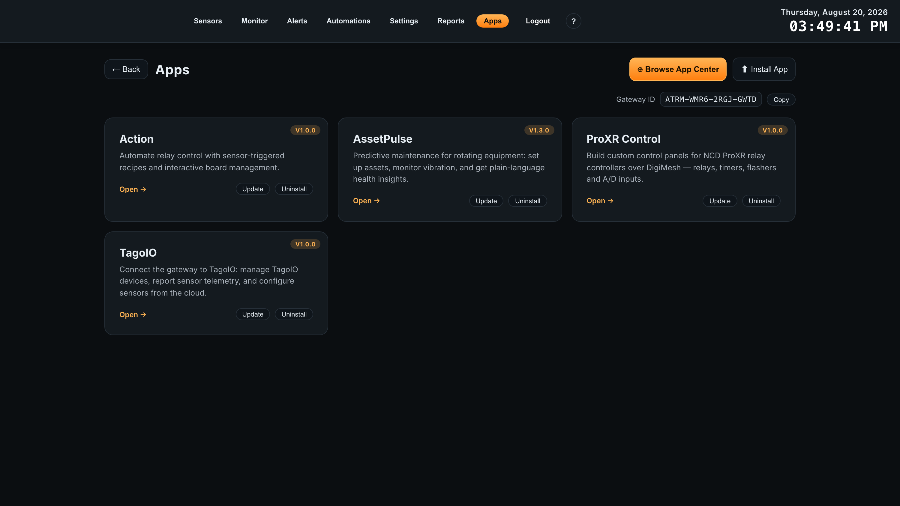
The Apps page
Open Apps from the Atrium navigation. This page lists the apps installed on this gateway, and it is where AssetPulse appears once it is installed. Each card shows the app’s installed version and its controls: Open to launch it, Update when a newer version has been published, and Uninstall to remove it.
Two buttons sit at the top of the page. Browse App Center opens the catalog of published apps, and Install App installs one from a package file — the route for a pre-release build or an app supplied directly by NCD.
This page is also where you find the Gateway ID, an identifier in the
form ATRM-XXXX-XXXX-XXXX, with a Copy button beside it. A
license is issued against one specific gateway, so that ID is what you supply when you
request one — copy it from here rather than transcribing it from the label on the
enclosure.
Installing from the App Center
-
1
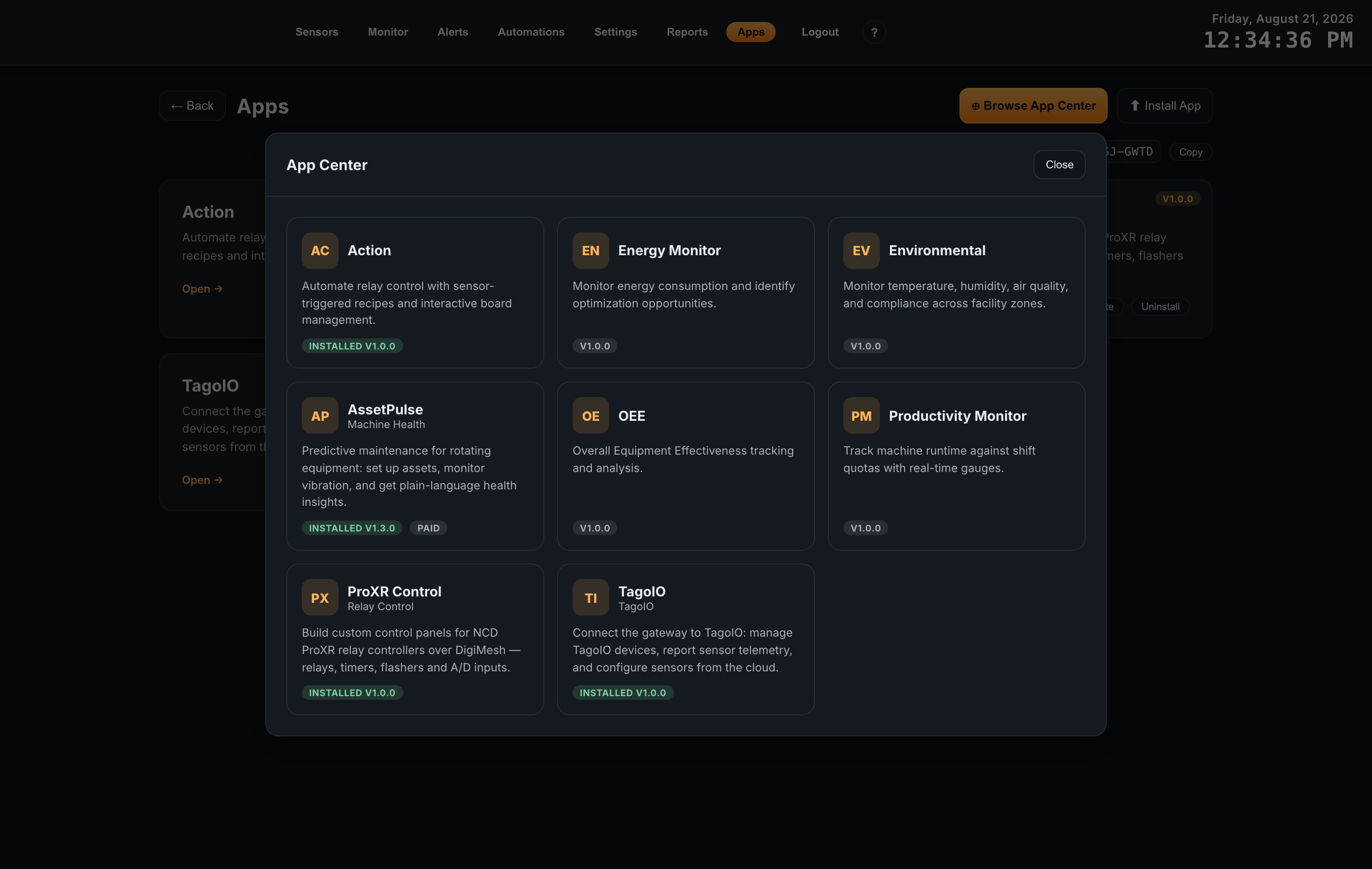
Open the App CenterOn the Apps page, click Browse App Center. The catalog opens over the page and lists every app published for Atrium gateways; the ones already on this gateway carry an INSTALLED badge with their version.
-
2
Find AssetPulseIts card is titled AssetPulse with the subtitle Machine Health, and carries a PAID badge marking it as a licensed app.
-
3
Install itIf this gateway does not meet a requirement — the wrong model, or a platform version older than the app needs — the App Center says which requirement is unmet instead of offering the install.
-
4
Request and apply your licenseAssetPulse is a licensed app, and licenses are free during Beta. contact us to request one, quoting the Gateway ID from the Apps page — a license is issued against that one gateway. Apply the license file you receive, and you are done: verification is offline, so the gateway does not need internet access to stay licensed.
-
5
Open AssetPulseClick Open on the AssetPulse card. The app runs inside Atrium, with its own left-hand navigation: Overview, Assets, Alerts and Settings.
04Adding an Asset
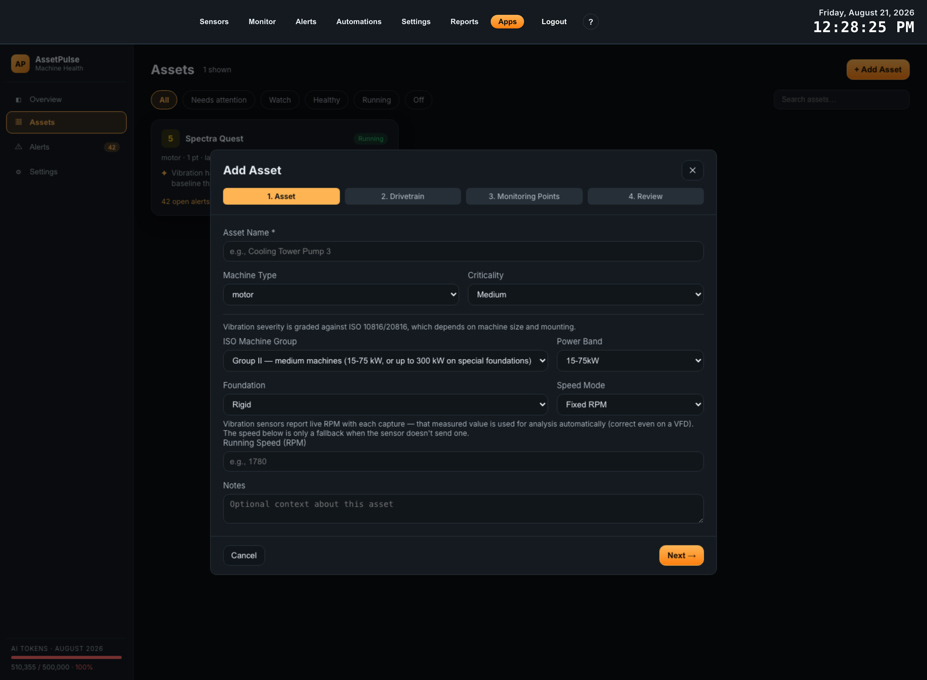
An asset is a machine you want to watch. Go to Assets and click + Add Asset to open a four-step wizard. What you enter here is what makes the analysis precise — the same vibration reading means different things on a small fan and a large rigid-mounted motor.
Step 1 — Asset
Describe the machine itself.
| Field | What it does |
|---|---|
| Asset Name (required) | How the machine appears throughout the app, for example Coolant Pump P-101. |
| Machine Type | motor, pump, fan, gearbox, compressor, blower, or other. |
| Criticality | Low, Medium, or High — how much this machine matters to you. |
| ISO Machine Group | Group I (small, under 15 kW), Group II (medium, 15-75 kW or up to 300 kW on special foundations), Group III (large, rigid foundation), or Group IV (large, flexible foundation). |
| Power Band | Under 15 kW, 15-75 kW, 75-300 kW, or over 300 kW. |
| Foundation | Rigid or Flexible. |
| Speed Mode | Fixed RPM, Variable (VFD), or From tach metric. |
| Running Speed (RPM) | Shown for Fixed RPM. For Variable (VFD) the fields become Min RPM and Max RPM; From tach metric asks for nothing. See the note below — which value actually gets used depends on this choice. |
| Notes | Optional context — useful for recording when a baseline was taken. |
Machine group, power band and foundation together decide which ISO zone boundaries apply, so they are worth getting right rather than leaving at the defaults.
Step 2 — Drivetrain
A machine is not one object — it is a power path. Step 2 is where you list the parts of that path, driver first: the motor, then whatever it turns through whatever couples them. A pump skid might be motor → coupling → pump; a cooling tower might be motor → belt → fan.
This matters because rotating machines fail at predictable frequencies. A pump with 6 impeller vanes pushes energy at 6 times shaft speed; a 23-tooth gear meshes at 23 times its shaft speed; a 4-pole motor shows electrical faults near line frequency. Once AssetPulse knows the parts, it knows which frequencies to look at, and a peak in the spectrum stops being “energy at 174 Hz” and becomes “vane pass frequency”. Without the drivetrain it can still grade overall vibration severity — it just has fewer names to give what it finds.
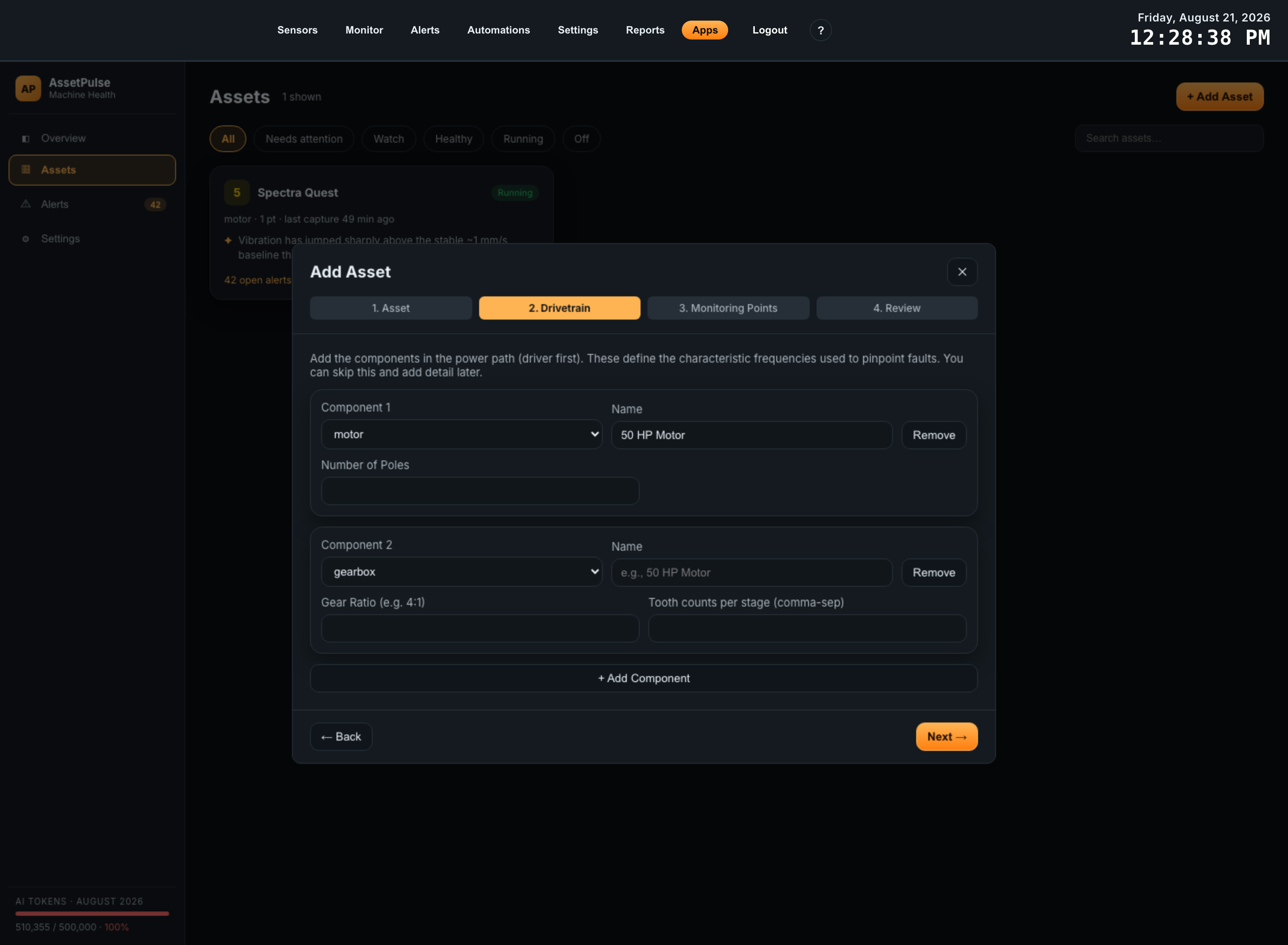
Adding a component
Click + Add Component. Each component appears as its own card with:
- Component N — the type. Choosing the type is what reveals the parameter fields below it, so set this first.
- Name — free text, how the component reads in the app, for example 50 HP Motor or Gearbox (4:1).
- Remove — deletes that card.
Add them in power-path order. The position of each card is the drivetrain order, so a component added out of sequence should be removed and re-added rather than left in the wrong place.
Parameters by component type
Each type asks only for what it needs. These values build the kinematic model that is handed to the analysis engine with every capture; leave one blank and the frequency it would have defined is simply not part of the model.
| Type | Parameters | The frequency it defines |
|---|---|---|
| motor | Number of Poles | Poles and supply frequency fix the motor’s synchronous speed (a 4-pole motor on 60 Hz turns at 1800 RPM unloaded), which is the reference for electrically-driven vibration. |
| gearbox | Gear Ratio (e.g. 4:1) Tooth counts per stage (comma-separated) | Gear mesh frequency — teeth × that shaft’s speed, per stage — and the output shaft speed implied by the ratio. |
| pump | Impeller Vane Count | Vane pass frequency — vanes × shaft speed. Where cavitation, recirculation and vane damage show up. |
| fan / blower | Blade Count | Blade pass frequency — blades × shaft speed. What separates a fouled or damaged wheel from ordinary imbalance. |
| belt | Pulley Ratio | The driven-side shaft speed, and the belt’s own rotation rate. |
| coupling | None | Nothing on its own — it records the coupling as part of the power path. |
| other | None | A placeholder so the power path can be described completely. |
Skipping it, and adding it later
Step 2 is optional — Next works with an empty list. Anything you skip can be added later from the asset’s Setup tab, and the next capture is analyzed with the detail you have added by then. Earlier captures keep the scores they were originally given; they are not re-analyzed.
One thing to come back for: in step 3 each monitoring point can be attached to a component through the On Component field. That attachment is how a finding gets pinned to a part of the machine rather than to the asset as a whole, and it can only point at components that exist — so components added here are what make that field useful.
Step 3 — Monitoring Points
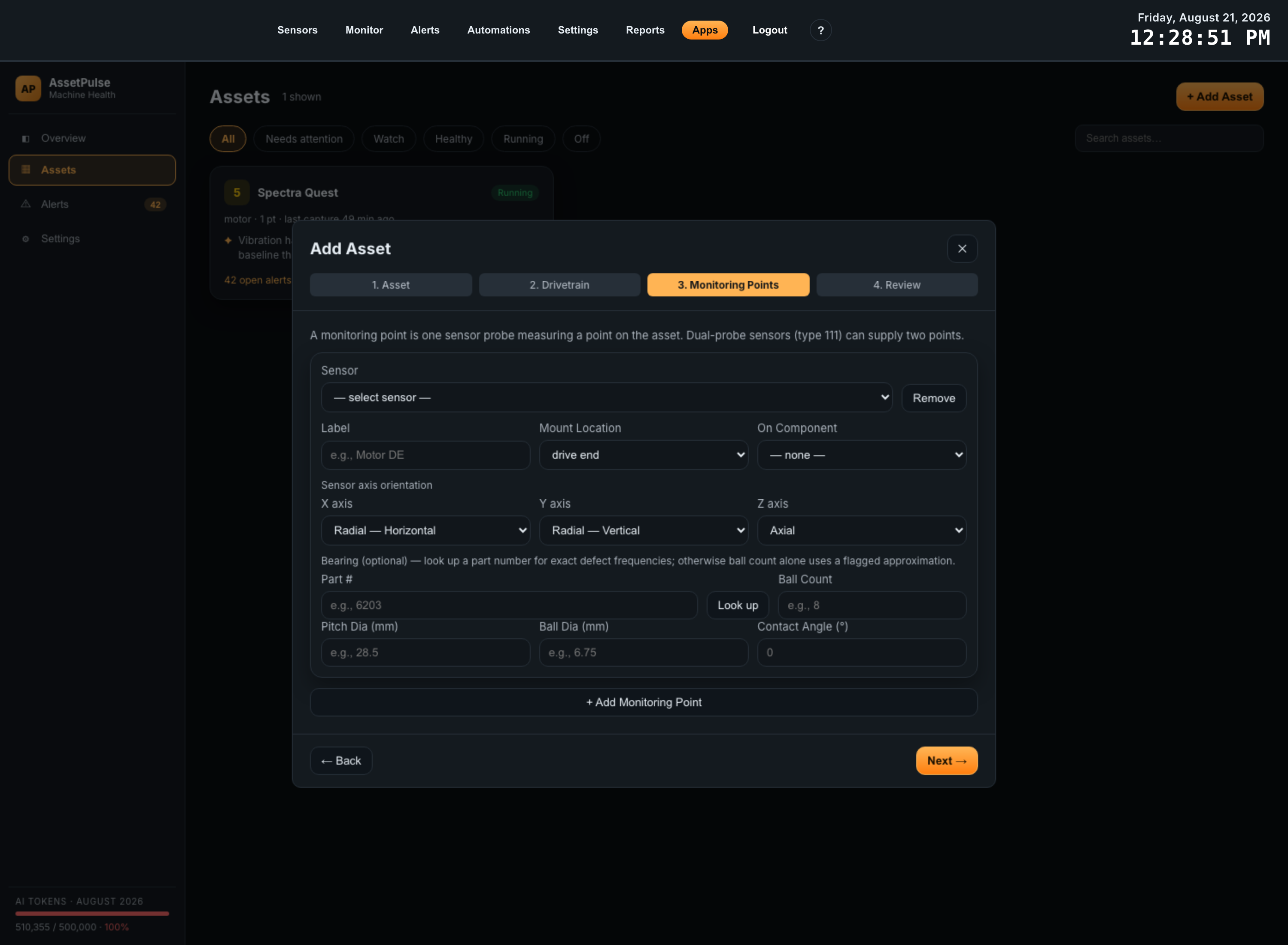
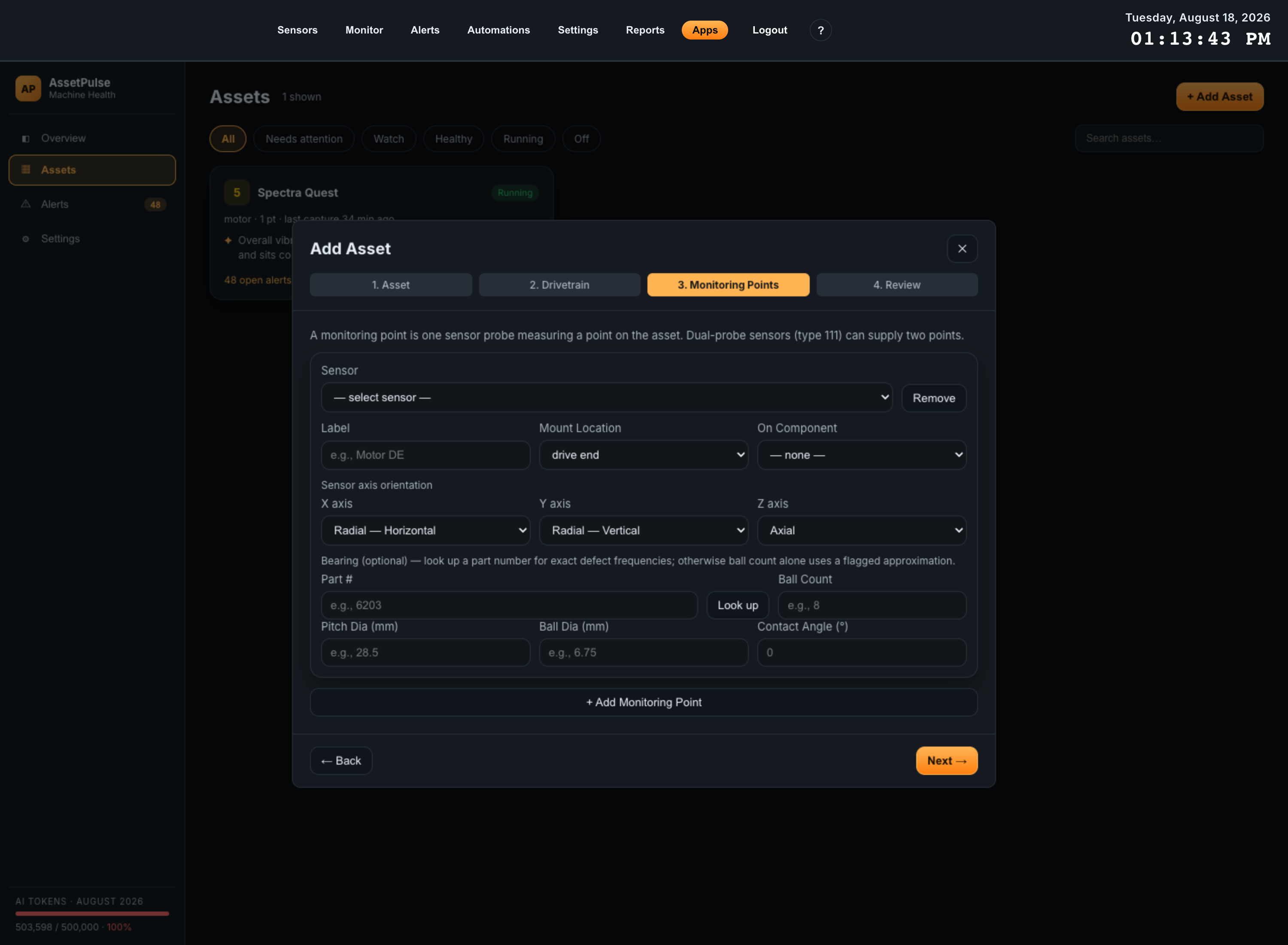
A monitoring point is one sensor probe measuring one point on the machine. Click + Add Monitoring Point and fill in:
| Field | What it does |
|---|---|
| Sensor | Which vibration sensor measures this point. Dual-probe sensors are marked (dual-probe) and can supply two points. |
| Label | A short name for the point, for example Motor DE. |
| Mount Location | drive end, non drive end, inboard, outboard, casing, or other. |
| On Component | Which drivetrain component from step 2 this point sits on. |
| Sensor axis orientation | What the sensor’s X, Y and Z axes mean on this machine: Radial-Horizontal, Radial-Vertical, Axial, or Tangential. |
| Bearing (optional) | The bearing at this point. See below. |
For bearings, entering a part number and clicking Look up gives exact defect frequencies. If you only supply ball count, pitch diameter, ball diameter and contact angle, the analysis uses a flagged approximation instead.
Step 4 — Review
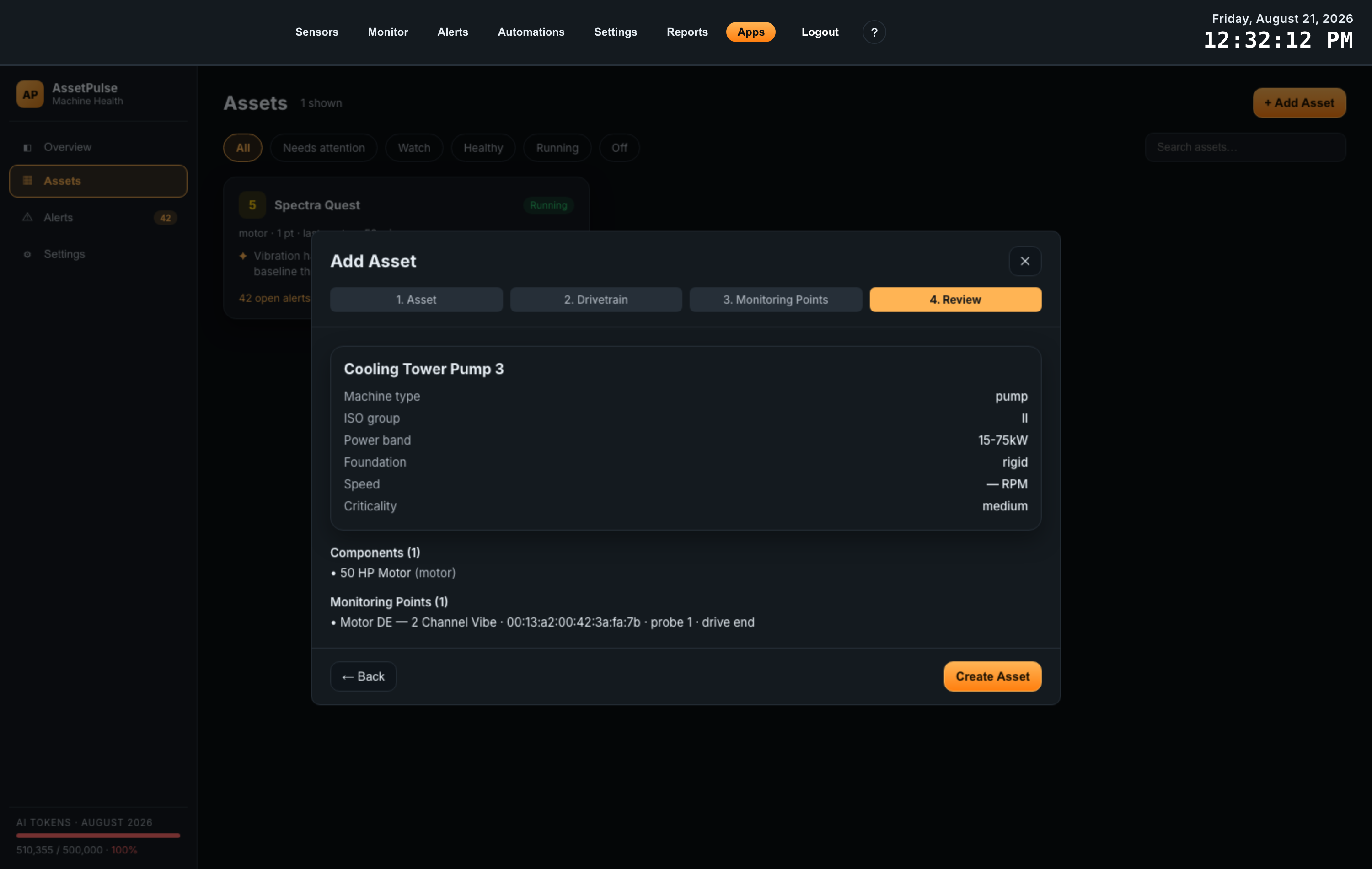
The last step is a read-only summary of everything the wizard is about to create. Check it before saving — the machine description is what every future severity score is graded against, and a wrong ISO group or a missing vane count is far cheaper to fix here than to notice a month later in the trend.
| Block | What to check |
|---|---|
| Asset summary | Name, machine type, ISO group, power band, foundation, speed, criticality. Speed reads back as 1780 RPM, as 600-1800 RPM (VFD), or as From tach metric, depending on the speed mode. |
| Components (n) | One line per drivetrain component, in power-path order, with its type in brackets. The count in the heading is the quickest check that nothing was lost. |
| Monitoring Points (n) | One line per point: label, sensor name and device ID, probe number for dual-probe sensors, and mount location. A point showing (unlabeled) still works, but it is worth going back for a name. |
← Back returns through the steps with everything you entered intact, so correcting something costs nothing. Create Asset saves the asset, its components and its monitoring points together in one operation — there is no half-saved state to clean up if something is rejected.
What happens after you save
The asset appears on the Assets list straight away, showing No assessment yet — it has no severity score because scores come from waveform captures, and it has not seen one yet. From here:
- The first score arrives with the next capture from one of its sensors. Every capture that lands on one of this asset’s monitoring points is analyzed automatically from now on.
- To get one immediately, open the asset, go to Telemetry and click Request Waveform. The sensor takes the capture on its next sync rather than instantly.
- Historical captures are not back-filled. Captures that arrived before the asset existed are not analyzed retroactively, and neither are earlier captures re-analyzed when you add drivetrain or bearing detail later. Trending starts now.
- The baseline takes a few captures. Until roughly five running captures have been folded in, the Health tab reports the baseline as learning… rather than a ratio.
Everything entered in the wizard remains editable from the asset’s Setup tab, so a rough first pass is a reasonable way to start — get the sensor attached and the ISO class right, then add drivetrain and bearing detail as you learn the machine.
05Overview Screen
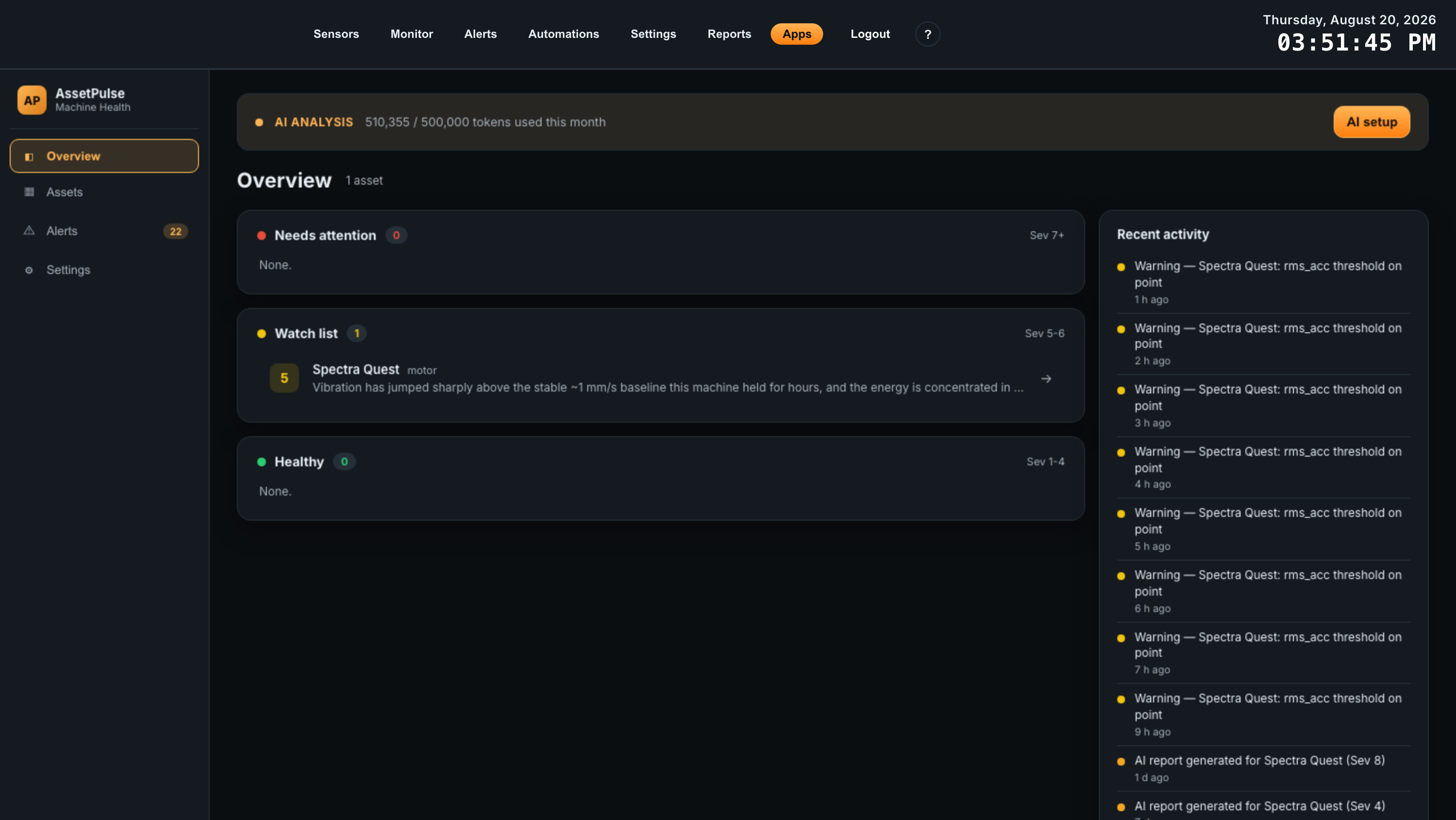
The landing screen answers one question: what needs attention right now. Assets are grouped into three severity bands, with a feed of recent activity underneath.
| Band | Severity | Meaning |
|---|---|---|
| Needs attention | 7 and above | Investigate now. |
| Watch list | 5 to 6 | Something is developing; keep an eye on the trend. |
| Healthy | 1 to 4 | Running as expected. |
Recent activity lists threshold warnings and report generations across all assets, newest first, so you can see what changed since you last looked.
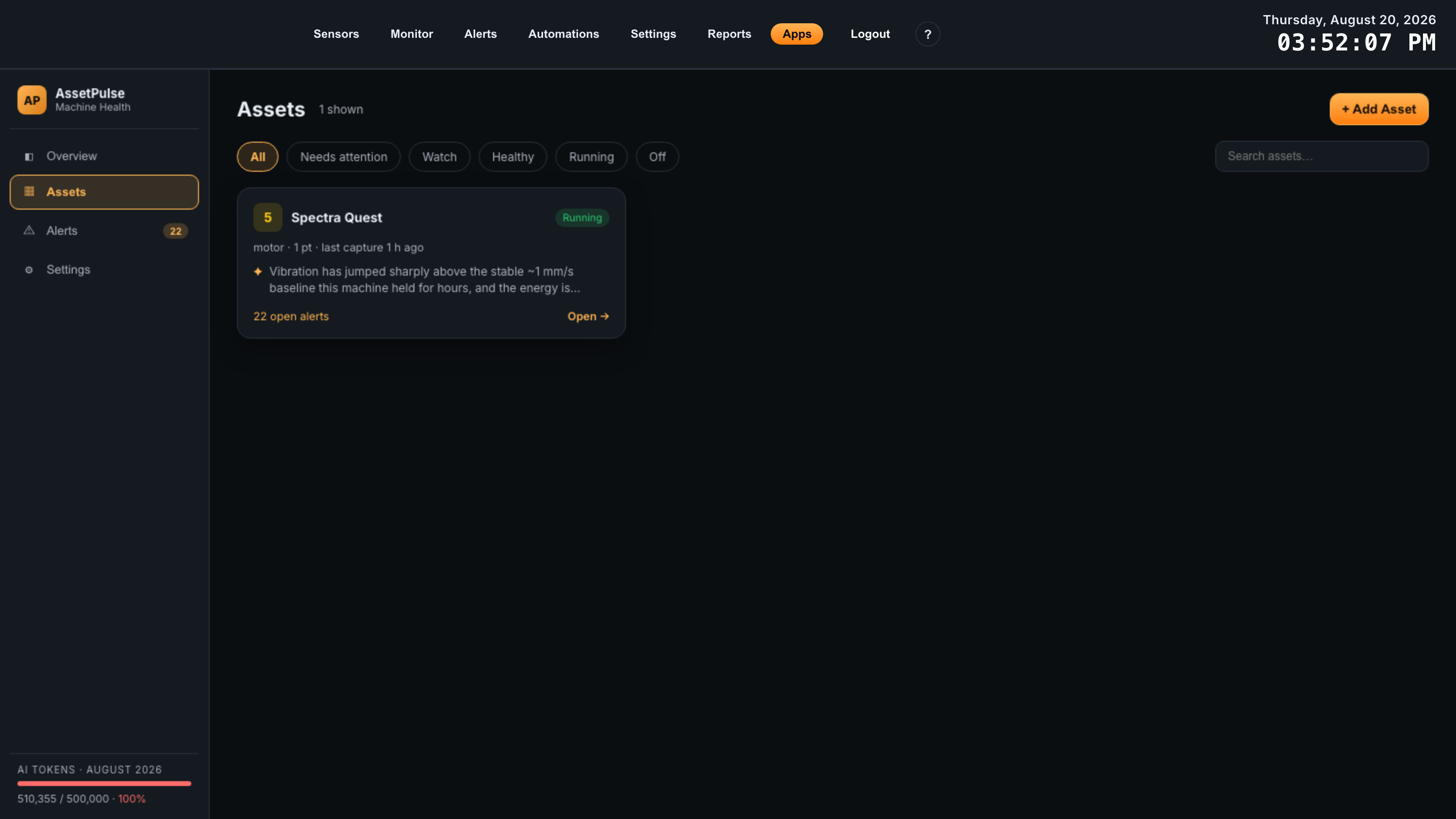
The Assets screen is the full list, filterable by All, Needs attention, Watch, Healthy, Running and Off, with a search box. Each card shows the severity score, run state, machine type, how many monitoring points it has, when it last captured, the latest assessment, and its open alert count.
06The Asset View
Clicking an asset opens its own view. The header carries the asset name and, underneath, the description it is being graded against — machine type, ISO group, power band, running speed and criticality. If the machine was stopped during its most recent capture, an Off — last capture badge sits next to the name and the last running assessment continues to stand.
Below the header are five tabs. They are ordered the way an investigation runs: what is wrong (Health), the measurements behind it (Telemetry), what the app has already done about it (Activity), what you did about it (Service), and how the machine is described (Setup). The view refreshes itself roughly every ten seconds, so a new capture or report appears without leaving the page.
1. Health
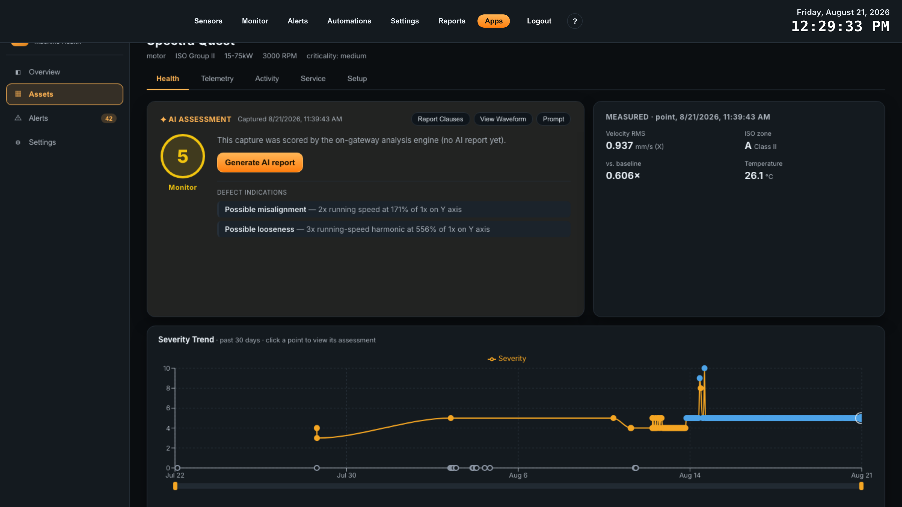
Health is where AssetPulse earns its place. Everything else on the gateway records measurements; this tab turns one waveform capture into a graded, explained verdict about a specific machine, and puts thirty days of those verdicts on one chart.
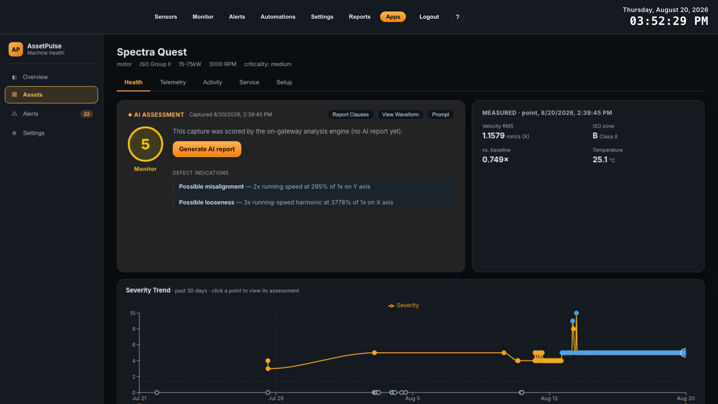
The tab has three parts: the AI Assessment panel on the left, the Measured panel on the right, and the Severity Trend chart underneath. The important thing to understand first is that the two panels always describe one single capture — the one currently selected on the trend chart. Click a different point on the trend and both panels change to that moment in the machine’s history.
The AI Assessment panel
The panel header names the capture it is describing — Captured <date and time> — followed by the actions that operate on that capture: Report Clauses, View Waveform, Prompt, and Regenerate (or Generate AI report where no report exists yet). Each is covered below.
The body of the panel holds, in order:
| Element | What it tells you |
|---|---|
| Severity ring | A single number from 1 to 10 with its label, colored to match. Where an AI report exists this is the AI’s severity; where one does not, it is the on-gateway engine’s score. A dash means the capture has no score — which happens when the machine was off. |
| Assessment | The written verdict, in plain language: what the evidence looks like, and what it most likely means for this machine. This is the part the AI writes. |
| Recommended action | One of five categories, from least to most urgent: Monitor, Monitor Closely, Plan Repair, Repair Now, Shut Down. |
| Confidence | High, Medium or Low — how strongly the evidence supports the conclusion. Low confidence on a high severity is a reason to request another capture rather than to dispatch a crew. |
| AI usage | Tokens this report consumed, so a report’s cost is visible next to the report itself. The running monthly total sits at the bottom of the app’s left-hand navigation. |
| Defect indications | The named findings from the on-gateway engine, each with the evidence it rests on — for example Possible misalignment — 2x running speed at 230% of 1x on Y axis. These come from the gateway, not the AI, and appear whether or not AI is configured. |
The panel reads differently depending on what exists for the selected capture:
| Situation | What the panel shows |
|---|---|
| Capture analyzed, report written | The full assessment, action, confidence and usage described above. |
| Capture scored, no report yet, AI configured | “This capture was scored by the on-gateway analysis engine (no AI report yet)” and a Generate AI report button. |
| Capture scored, AI not configured | The same explanation, with a pointer to configure AI Reports in Settings. The severity ring and defect indications still work. |
| Machine was off during the capture | “Machine was off during this capture — no severity score.” A stopped machine has nothing to grade; scoring it would only produce a false all-clear. |
| No captures analyzed yet | “No captures analyzed yet.” Use Request Waveform on the Telemetry tab if you do not want to wait for the sensor’s own schedule. |
Severity bands
| Severity | Label | How to read it |
|---|---|---|
| 1 – 2 | Optimal | Nothing evident. This is what a healthy machine looks like. |
| 3 – 4 | Good | Normal running vibration, nothing developing. |
| 5 – 6 | Monitor | Something is present. Worth watching the trend rather than acting. |
| 7 – 8 | Warning | A defect is indicated. Plan work; this is the default level at which emails are sent. |
| 9 – 10 | Critical | Damage is likely already occurring. |
The 1-10 scale is an AssetPulse scale, not a published standard. The standardized part of the assessment is the ISO zone in the Measured panel, described next.
The Measured panel
Where the assessment is an interpretation, this panel is the raw evidence behind it. Its heading names the monitoring point and the capture time, so it is always clear which probe on the machine produced these numbers.
| Value | Meaning |
|---|---|
| Velocity RMS | Overall vibration velocity in mm/s, with the axis that produced the worst reading in brackets. Velocity, not acceleration, is what vibration standards are written in. |
| ISO zone | The zone that velocity falls in for this machine’s class, per ISO 10816 / 20816, with the class shown beside it. This is the number to quote to anyone who wants a standards-based answer. |
| vs. baseline | How this capture compares with the machine’s own established baseline, as a multiplier — 1.8× means nearly double its normal level. Reads learning… until the baseline is established, and established once set with no ratio yet available. |
| Temperature | Sensor temperature in °C at the moment of capture. A rising trend alongside rising vibration is a much stronger signal than either alone. |
The baseline is learned, not configured: the first several running captures from a monitoring point are averaged into its normal level, and once established that reference is frozen so a slowly worsening machine cannot quietly redefine “normal” for itself. Captures taken while the machine was off are never folded into it.
When the selected capture was taken with the machine stopped, this panel adds a note that the machine appears off and that the last running assessment still stands.
Severity Trend — and how to read the dots
The chart underneath plots one dot per capture over the past 30 days, with severity on the vertical axis. It is both the history of the machine and the navigation control for this whole tab.
Click anywhere on the chart to select the nearest capture. The selected dot grows and gains a ring, and the AI Assessment and Measured panels above jump to that capture — its assessment, its defect indications, its measured values, and its waveform. This is how you answer “what did this machine look like when the trend started to climb”: click the dot where it turned, and read the assessment from that day.
The dot colors are the important part:
| Dot | Legend | Meaning |
|---|---|---|
| Amber / yellow | AI analyzed | An AI report was generated for this capture. Selecting it shows the written assessment, its recommended action and its confidence. The plotted height is the AI’s severity. |
| Blue | Engine only | No AI analysis was performed on this capture. It is still fully scored and trended by the on-gateway engine, and still carries its measured values, defect indications and waveform — there is simply no written report. Selecting it offers Generate AI report. |
| Hollow gray, on the baseline | Capture — machine off | A capture taken while the machine was stopped. It has no severity, so it is drawn along the bottom rather than on the trend line. Useful for confirming the machine was actually idle, not silently healthy. |
Hovering any dot shows the exact time, the monitoring point, and whether the number is an AI Severity or an Engine Severity.
Report Clauses
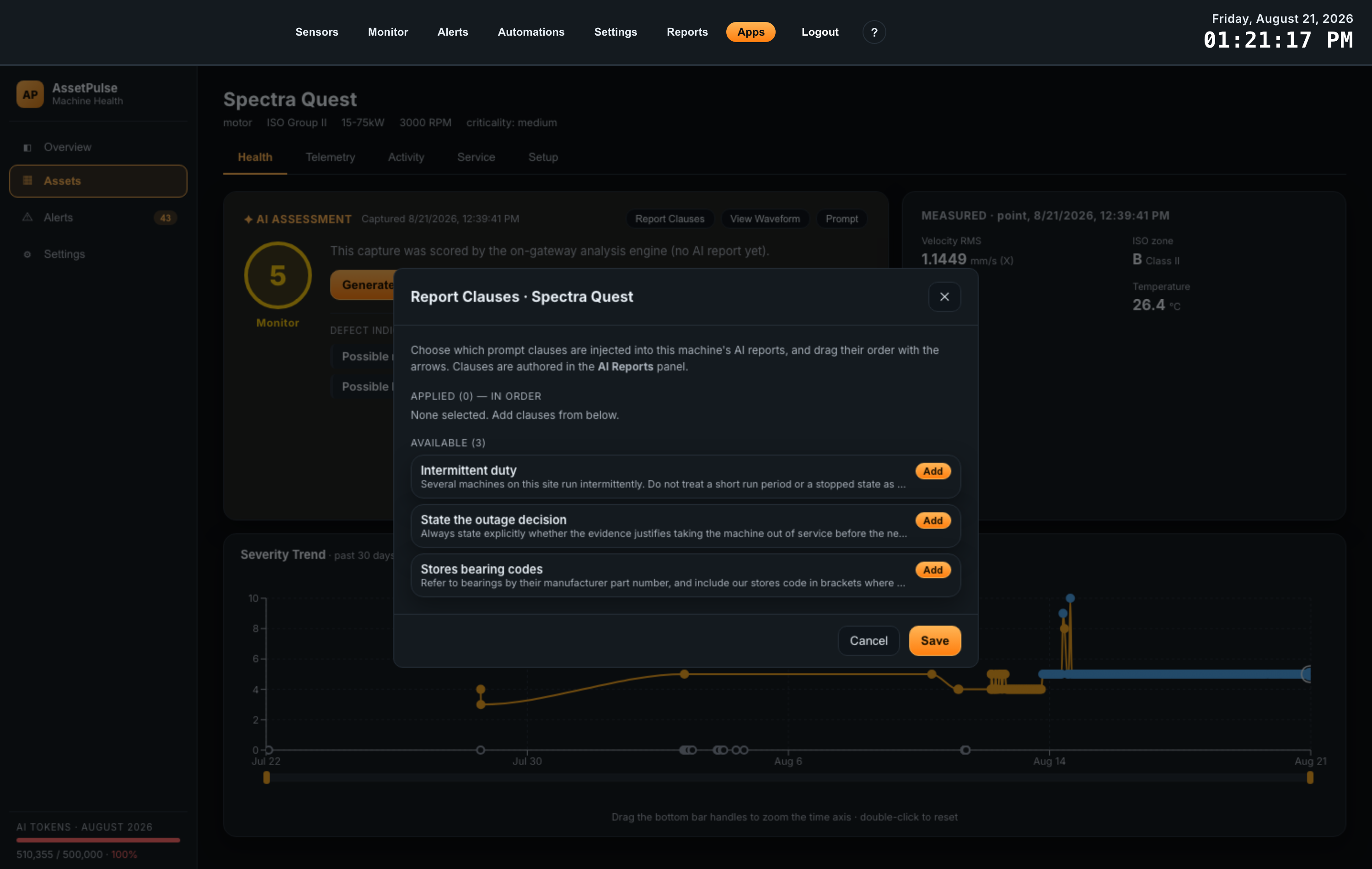
AI reports are useful in proportion to how much they know about your plant. Report Clauses is where you decide which standing instructions are added to this particular machine’s reports — things the analysis cannot infer, such as “this pump runs intermittently, so short run periods are expected”, “refer to bearings by our stores code”, or “always state whether the reading justifies an outage”.
The modal has two lists:
- Applied — the clauses this asset uses, in order. The arrows move a clause up or down, and Remove takes it out. Order matters because it is the order they appear in the prompt.
- Available — every other enabled clause in the library. Add appends it to the applied list.
Save applies the selection to this asset only, from the next report onward. The clauses themselves — their names and wording — are written once in Settings under AI Reports, then reused across assets; a clause shown as disabled has been switched off there and will not be sent even while it is listed here.
Prompt — seeing exactly what is sent
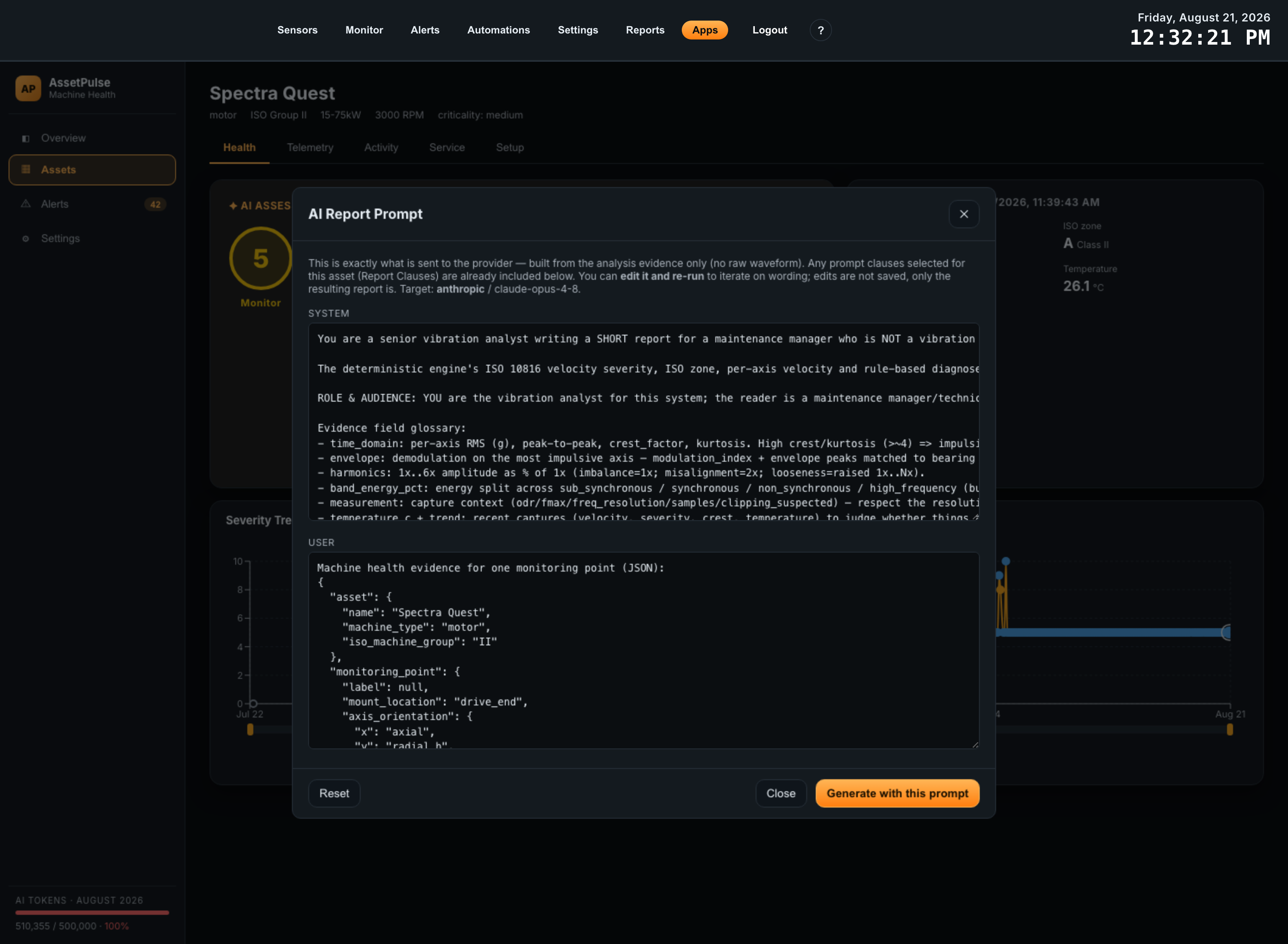
Prompt opens the complete request for the selected capture, in two parts: the System message that sets the analyst role and output format, and the User message carrying this capture’s evidence. The header names the provider and model it would go to. Any report clauses applied to the asset are already included in what you see.
Two reasons to open it. The first is trust: this is the whole payload, so you can confirm for yourself that what leaves the gateway is the structured analysis evidence and nothing else — no raw waveform is ever sent.
The second is iteration. Both boxes are editable, and Generate with this prompt runs the report using your edited text, so you can try a different wording on a real capture and read the result immediately. The title marks the prompt · edited once you change anything, and Reset restores it. Edits here are deliberately not saved — only the report they produce is kept. When you find wording that works, put it in the clause library so it applies from then on.
The Waveform viewer
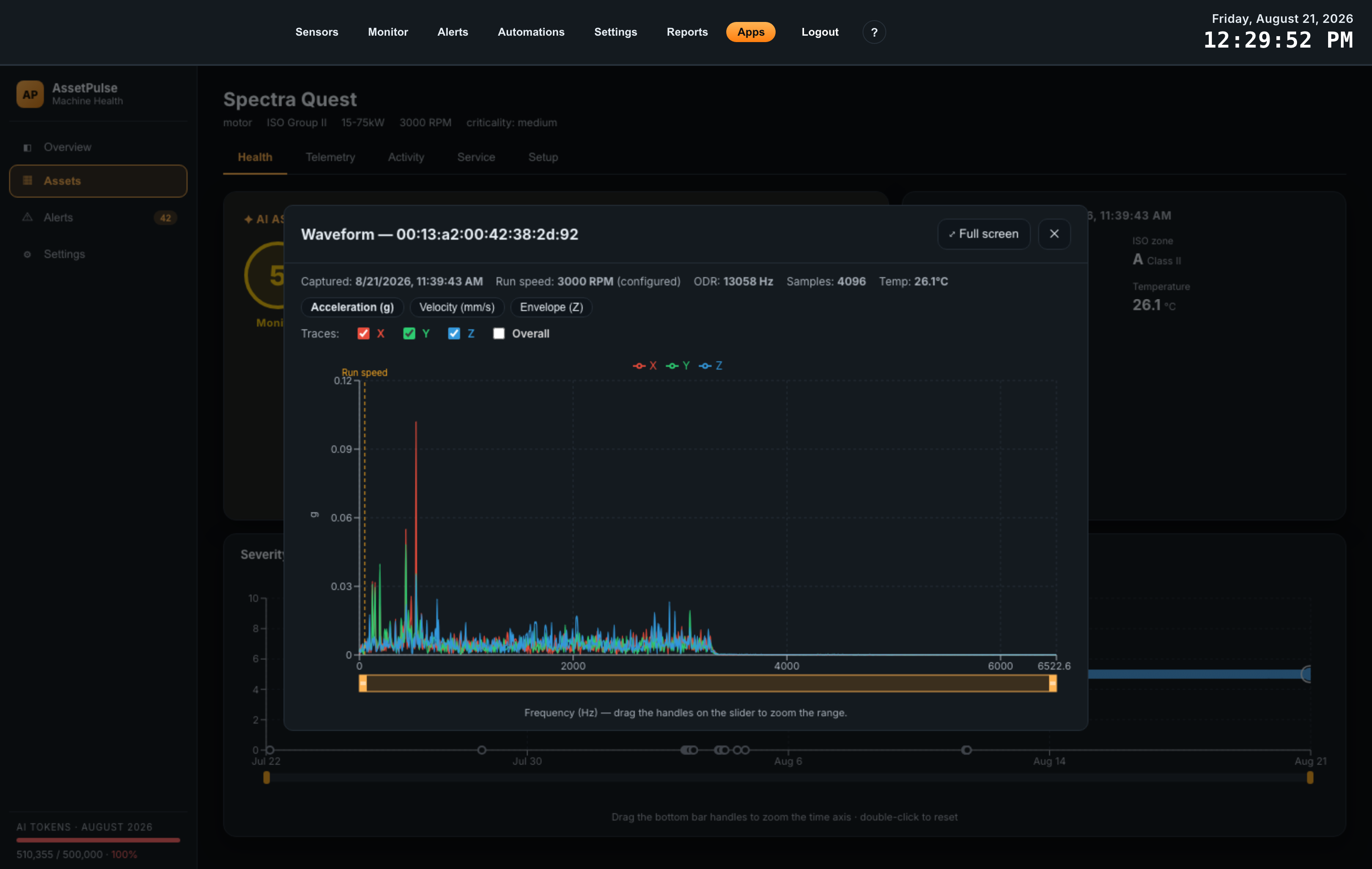
View Waveform opens the frequency spectrum of the selected capture — the evidence underneath everything else on this tab. The button appears only when the selected capture has a stored raw waveform behind it. The spectrum is computed on the gateway when you open the viewer, from the stored samples.
The strip along the top states the conditions of the capture: when it was taken, the run speed in RPM (marked configured when it came from the asset’s fixed speed and measured when the sensor reported it), the ODR (output data rate, in Hz — the sampling rate, which sets how high in frequency the spectrum can see), the number of samples, and the temperature.
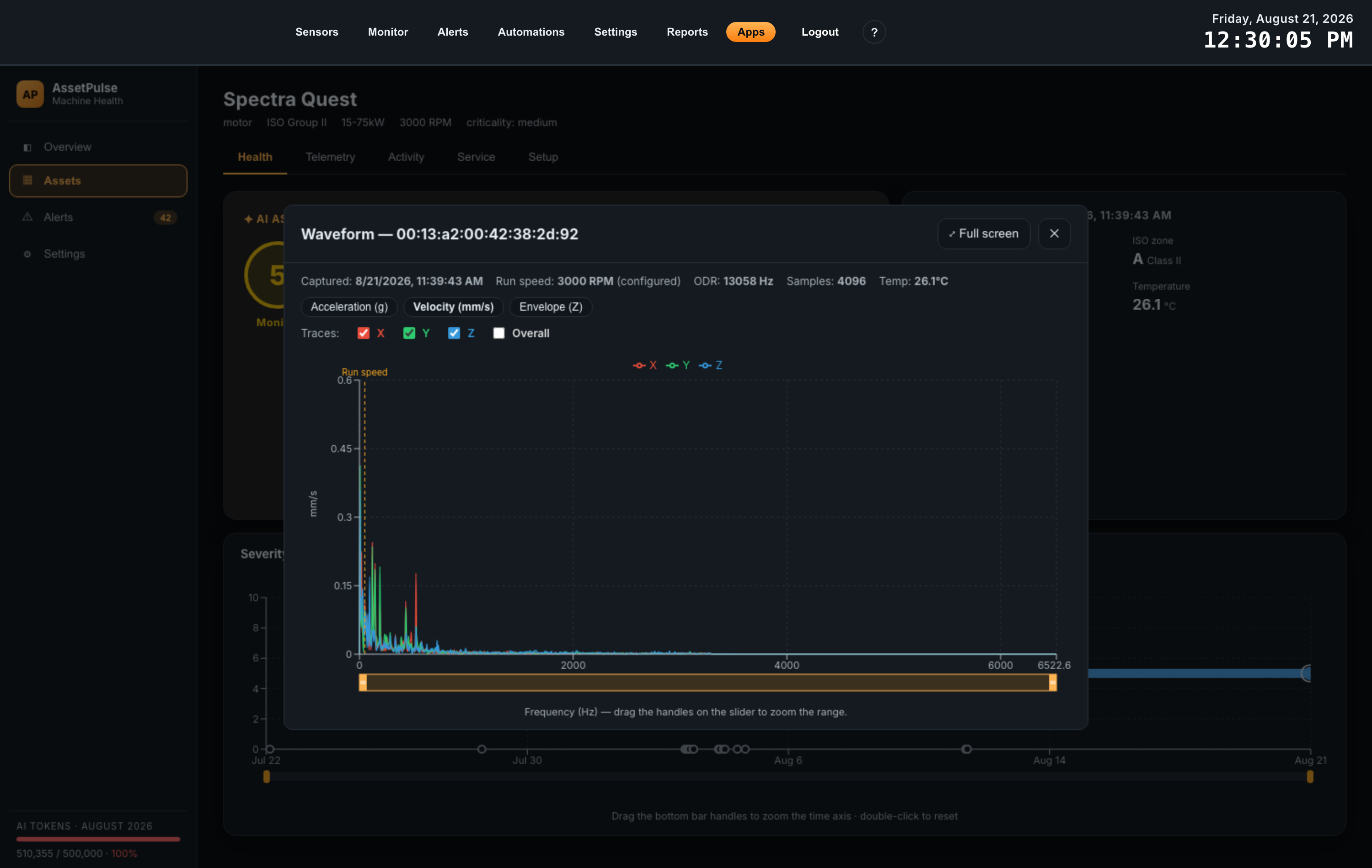
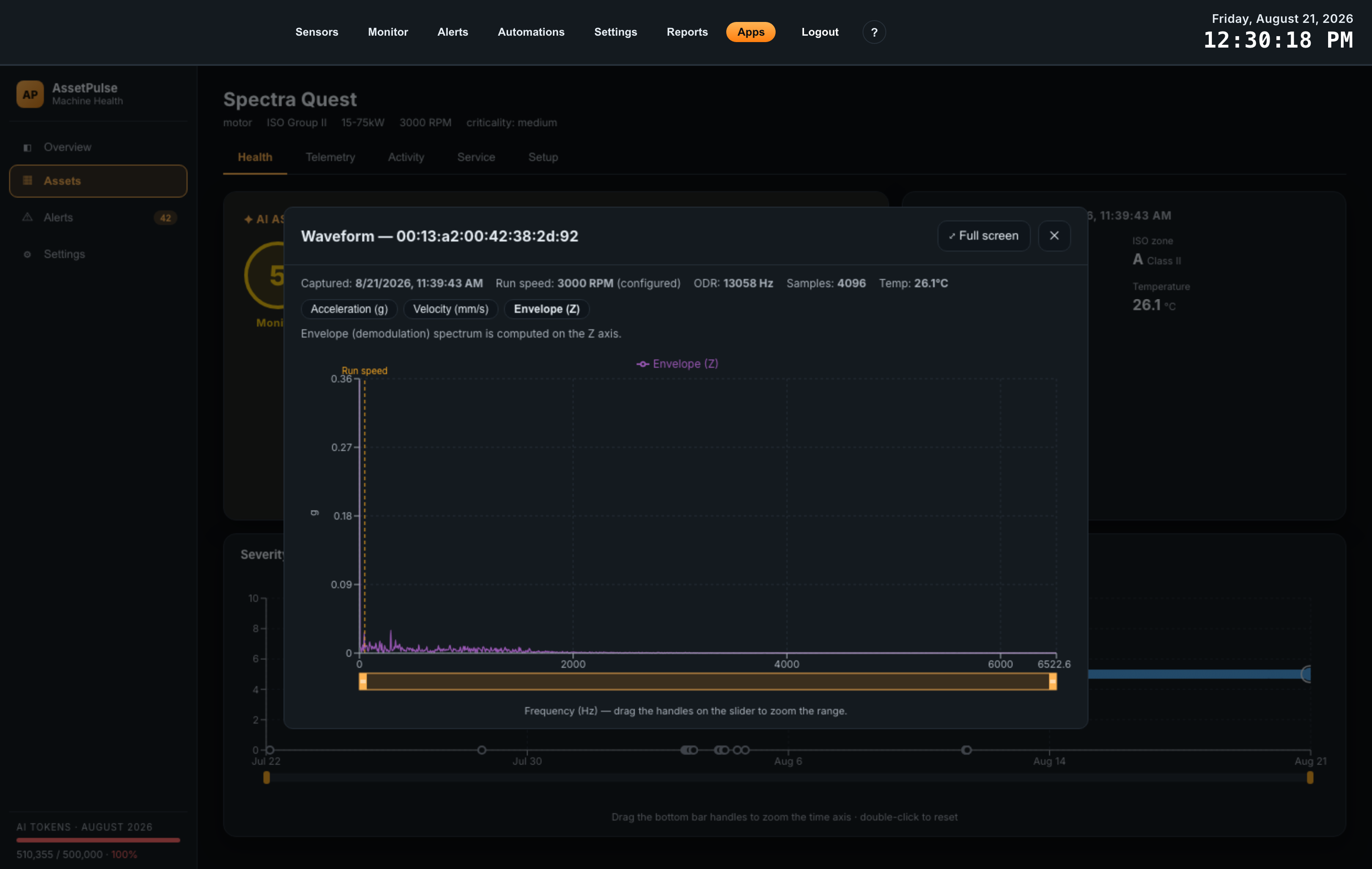
Three metric views, selected with the buttons above the chart:
| View | Unit | What it is for |
|---|---|---|
| Acceleration (g) | g | The default. Emphasises high-frequency content — bearing defects, gear mesh, looseness rattle. |
| Velocity (mm/s) | mm/s | The view that matches ISO severity limits. Emphasises low-frequency content — imbalance, misalignment, running-speed harmonics. |
| Envelope (Z) | g | Demodulation, computed on the Z axis only. It strips away the strong low-frequency vibration to expose the small repetitive impacts of early bearing damage, long before they show up in the ordinary spectrum. |
In the acceleration and velocity views, the Traces checkboxes turn the X, Y and Z axes on and off individually, plus Overall — the resultant of all three, off by default. Showing one axis at a time is the fastest way to confirm which direction a defect is acting in, which is exactly what the axis orientation you set on the monitoring point is there to make meaningful. The envelope view is Z-only, so it has no trace selection.
Two features make the spectrum readable rather than merely present:
- A dashed Run speed line marks 1x — one turn of the shaft. Nearly all vibration diagnosis is a question of where energy sits relative to this line.
- The tooltip reports every frequency both in Hz and as a multiple of run speed — “174.0 Hz (5.8× run speed)”. A peak at 2x suggests misalignment; a peak at the vane or blade count suggests the pumped or moved fluid; a peak at a non-integer multiple with sidebands suggests a bearing.
Drag the handles on the slider under the chart to zoom the frequency axis, and use Full screen when a crowded spectrum needs the room.
2. Telemetry
Health answers “what is wrong with this machine”. Telemetry answers “what have the numbers been doing”, and it is where you set the thresholds that make AssetPulse tell you about a change without being asked.
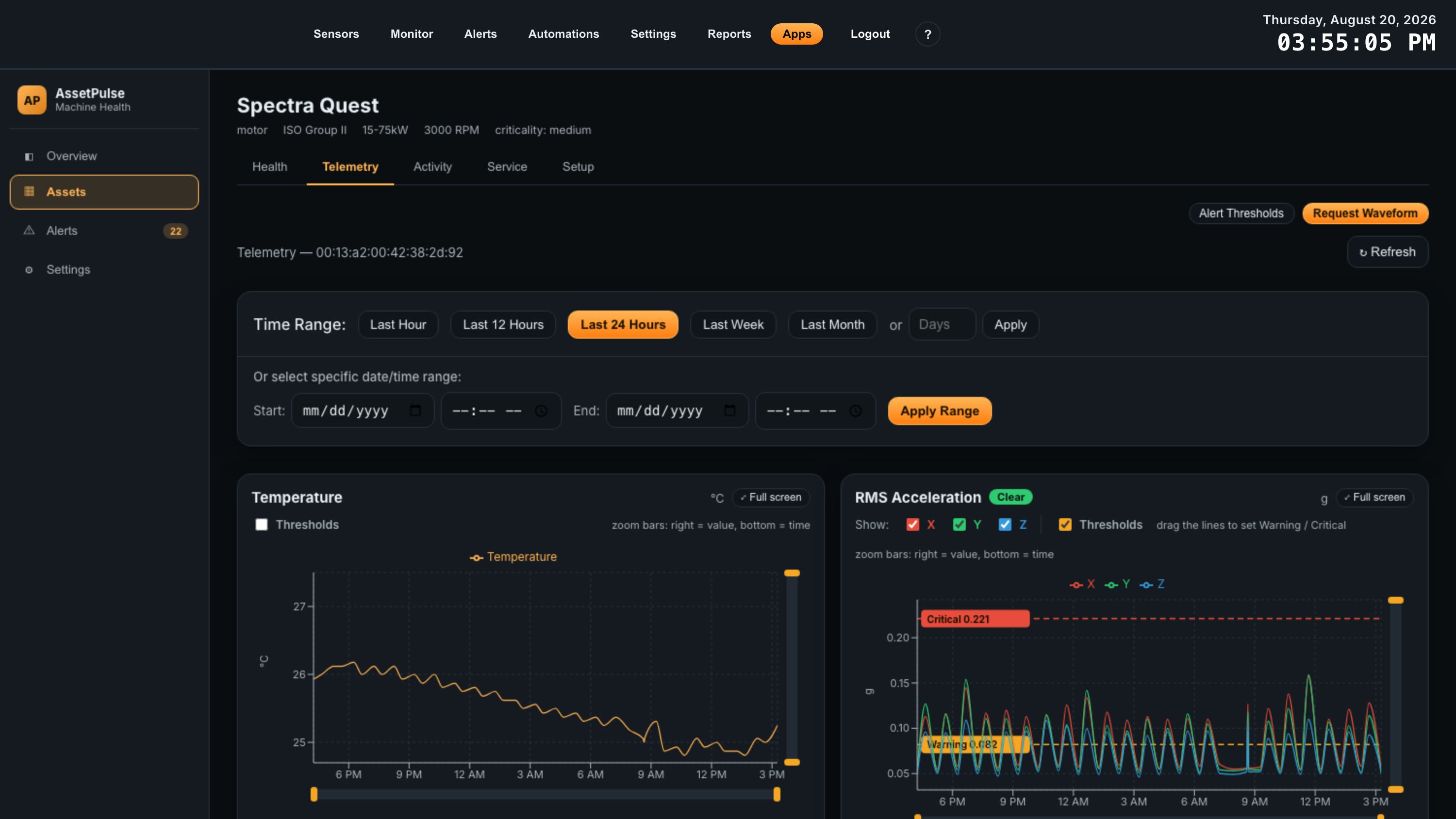
Everything on this tab is scoped to one monitoring point. Where an asset has more than one, the Monitoring point selector at the top switches between them; dual-probe sensors list each probe separately. Two buttons sit alongside it:
- Request Waveform queues a one-shot raw capture from this point’s sensor. The sensor is asleep between its scheduled reports, so it takes the capture on its next sync rather than immediately — then the capture is analyzed and appears on the Health tab as a new dot.
- Alert Thresholds opens the table of every threshold on this asset, described at the end of this section.
Refresh reloads the graphs for the current window.
Choosing a time range
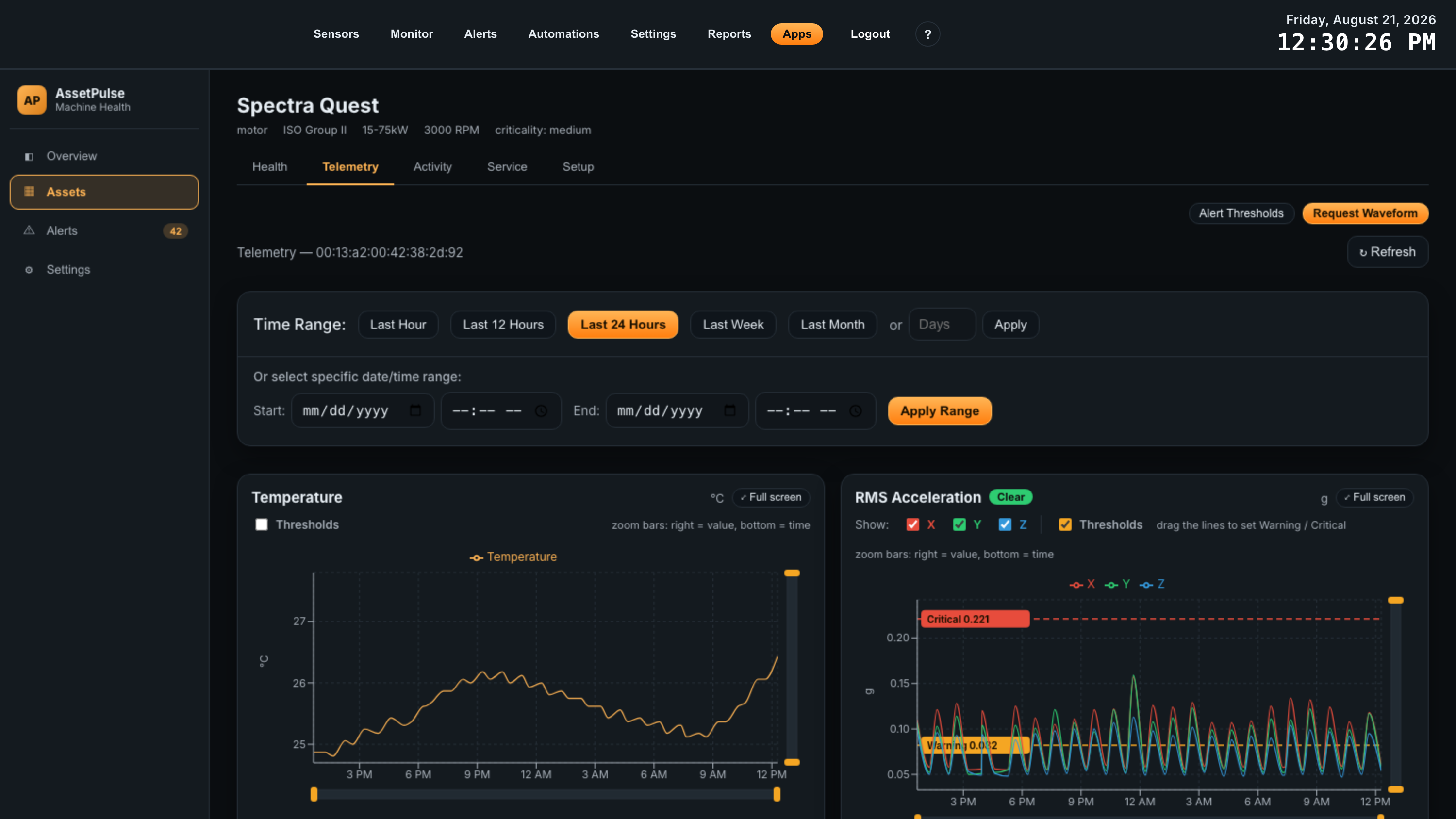
The panel at the top of the tab sets the window every graph below it draws. Preset buttons cover Last Hour, Last 12 Hours, Last 24 Hours, Last Week and Last Month. Beside them, a Days box with Apply takes any number of days from 1 to 365 — useful for “the last 90 days” without hunting for dates.
Under that, Or select specific date/time range takes an absolute Start and End date and time and applies it with Apply Range; Reset returns to Last 24 Hours. This is the one to use when you are comparing against a known event — the day a coupling was replaced, or the shift when an operator reported a noise.
Wide windows are averaged into buckets before they are drawn, because a month of raw readings is neither readable nor quick to load. The bucket size is chosen for you:
| Window | Each plotted point is |
|---|---|
| Up to 1 hour | a raw reading — no averaging |
| Up to 12 hours | a 1-minute average |
| Up to 24 hours | a 2-minute average |
| Up to 7 days | a 10-minute average |
| Up to 30 days | a 30-minute average |
| Over 30 days | a 1-hour average |
The seven graphs
Each monitoring point produces seven graphs. Together they are the sensor’s routine reporting — the small numbers it sends on every cycle, as opposed to the full waveform captures behind the Health tab.
| Graph | Unit | Series | What it is good for |
|---|---|---|---|
| Temperature | °C | one | Bearing and lubrication trouble usually shows as heat as well as vibration. A step change with no vibration change often means a cooling or load problem instead. |
| RMS Acceleration | g | X, Y, Z | The everyday measure of how much the machine is shaking. The most useful single trend to set a threshold on. |
| Acceleration Max | g | X, Y, Z | The peak within each reporting period. Rising max with steady RMS points at impacts — looseness, a spalled bearing race — rather than at general roughness. |
| Velocity | mm/s | X, Y, Z | The quantity ISO severity is written in. This is the trend to quote when discussing whether a machine is inside standards. |
| X / Y / Z Peak Frequencies | Hz | Peak 1, 2, 3 | Three graphs, one per axis, each tracking where the sensor found its strongest three frequencies. When a dominant peak moves or a new one takes over, something in the machine has changed character — a strong prompt to open the waveform viewer. |
Working with a graph
Every graph carries the same controls.
| Control | Behavior |
|---|---|
| Status badge | Next to the title: Clear, Warning or Critical — where the latest reading sits against this graph’s thresholds. Absent until thresholds are set. |
| Series legend | Click an entry to hide or show that series. Isolating one axis is how you tell a horizontal problem from a vertical one. |
| Thresholds | The checkbox that turns this graph’s Warning and Critical lines on. See below. |
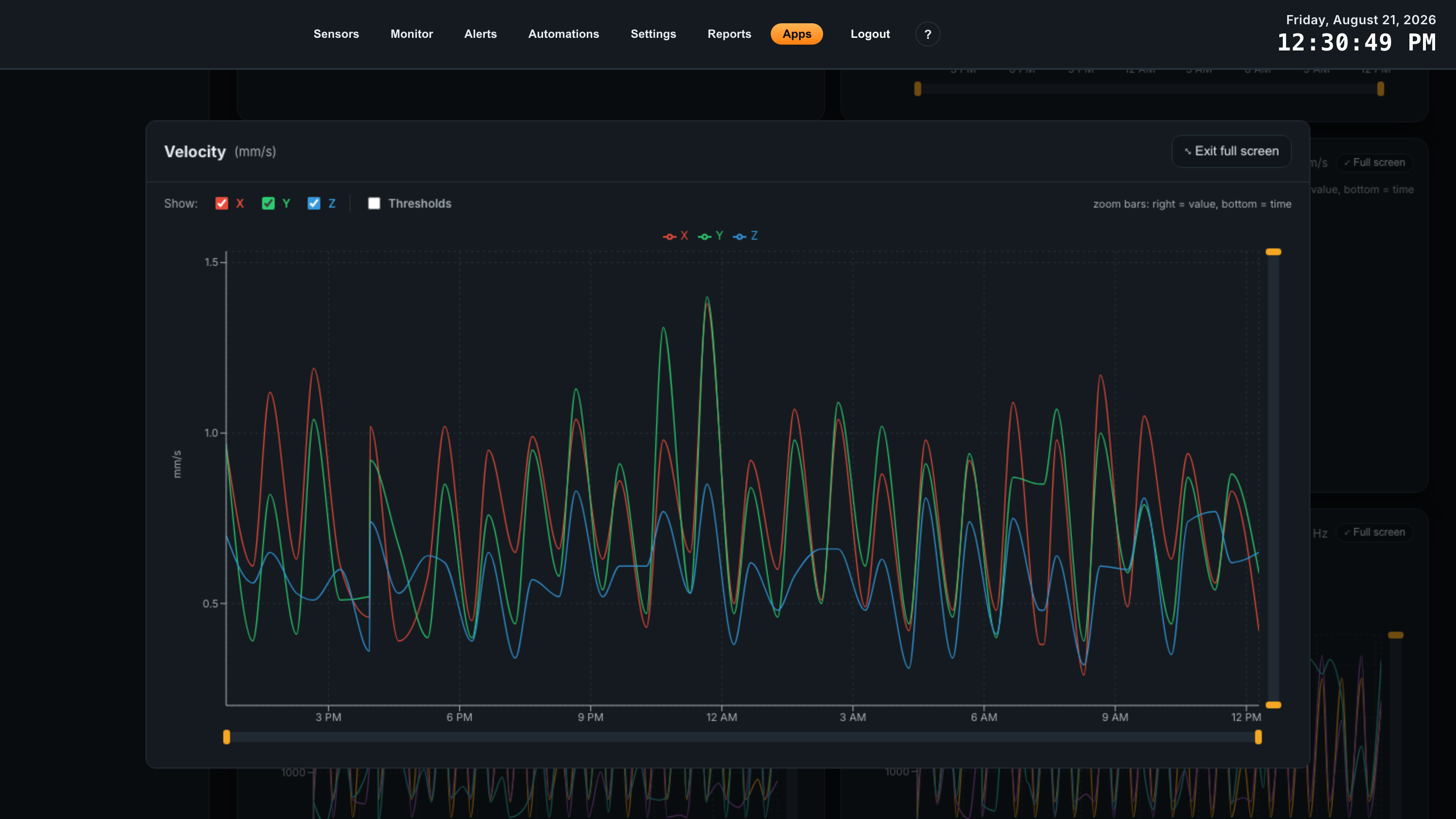
| Zoom bars | Two: the bar on the right zooms the value axis, the bar along the bottom zooms time. Drag a handle to resize the window, drag the middle to pan, double-click to reset. Reset zoom clears both. |
| Full screen | Opens the graph alone at full window size, with the same controls. The way to read a crowded trend. |
| No data in this time range | The graph has no readings in the current window — a wider range, or a sensor that has not reported. |
Setting thresholds by dragging
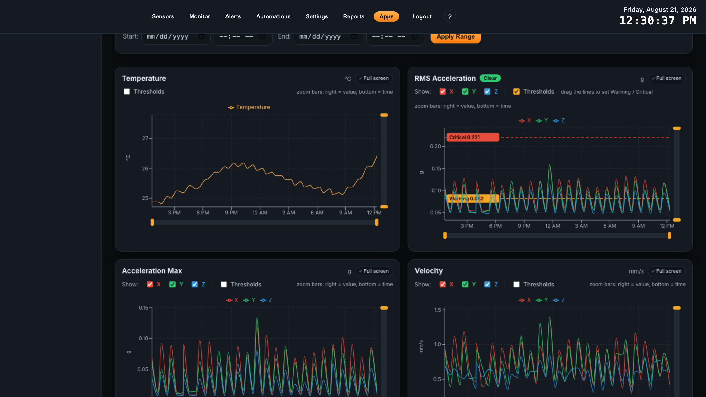
Tick Thresholds on a graph and two dashed lines appear across it: an amber Warning line and a red Critical line, each with a labelled tab showing its value. Drag a tab up or down to set the level; the value follows your drag and is saved when you let go. The graph keeps its scale while you drag, and leaves headroom above the data so a threshold can be placed above anything recorded so far.
Setting a threshold against a real trend is the point of doing it here rather than in a form: you can see the machine’s normal band, its daily variation, and where a line would have to sit to catch a genuine change without firing on every start-up. A common first pass is Warning a little above the highest normal peak, and Critical where you would want someone woken up.
Thresholds are stored per monitoring point, per graph — so the drive end and the non-drive end of the same machine can have different limits, and temperature limits are independent of vibration limits.
Alert Thresholds — deciding what a breach does
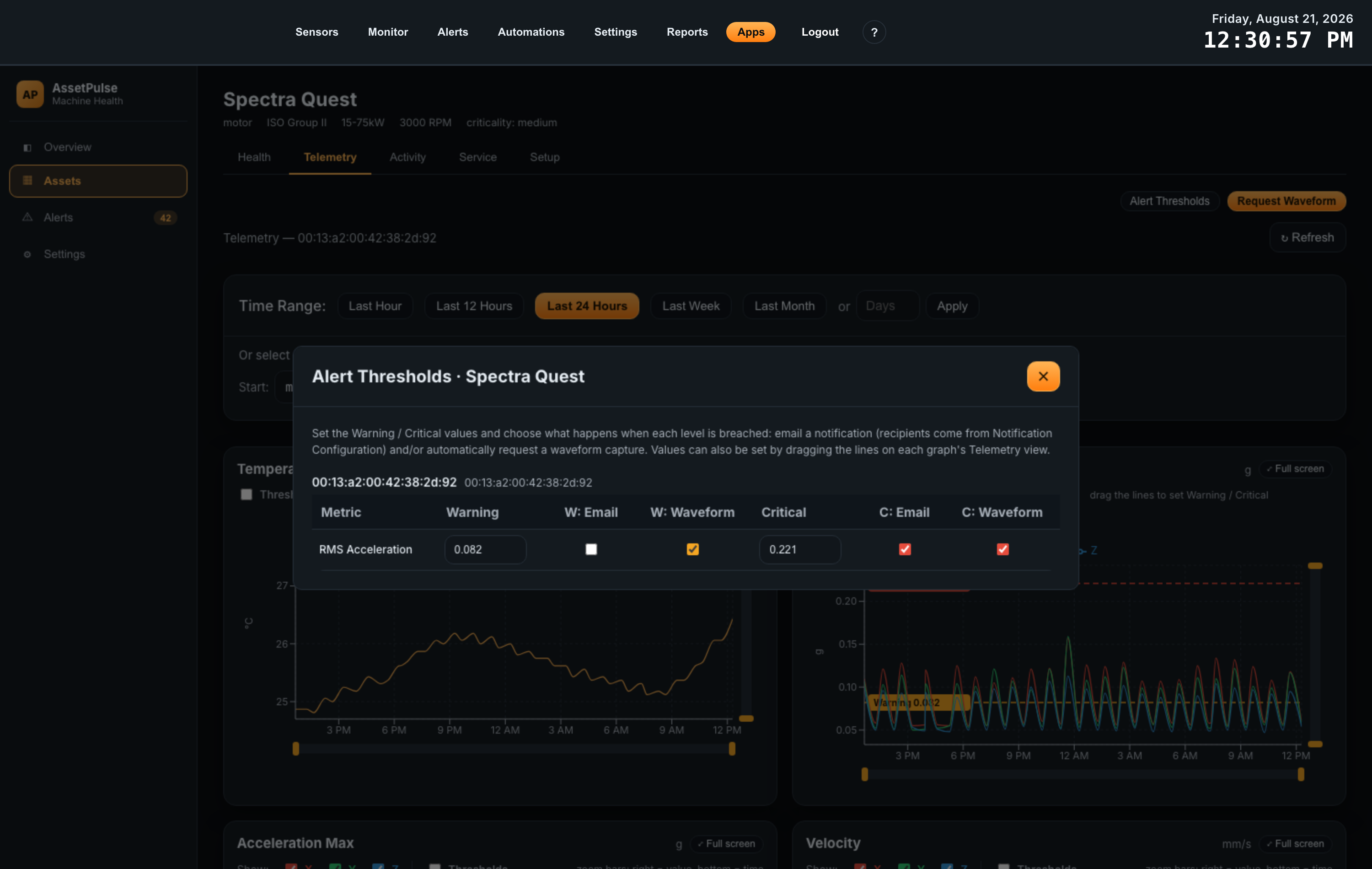
Dragging a line sets a value. What should happen when a reading crosses it is set in the Alert Thresholds table, reachable from this tab or from Activity. It lists every monitoring point on the asset, and for each graph that has thresholds:
| Column | What it does |
|---|---|
| Warning / Critical | The values themselves, typed rather than dragged. Clearing a value disables that level. |
| W: Email / C: Email | Email when this level is breached. Recipients come from Notification Configuration; delivery uses the gateway’s SMTP settings. |
| W: Waveform / C: Waveform | Automatically request a raw waveform capture when this level is breached — so the evidence for a problem is collected at the moment it appears rather than after someone gets round to looking. |
The checkboxes for a level stay disabled until that level has a value, and a point with no thresholds at all reads No thresholds set. Enable thresholds on this point’s Telemetry view first. — the values come from the graphs, the actions come from here.
3. Activity
What AssetPulse has already done about this machine, in two lists.
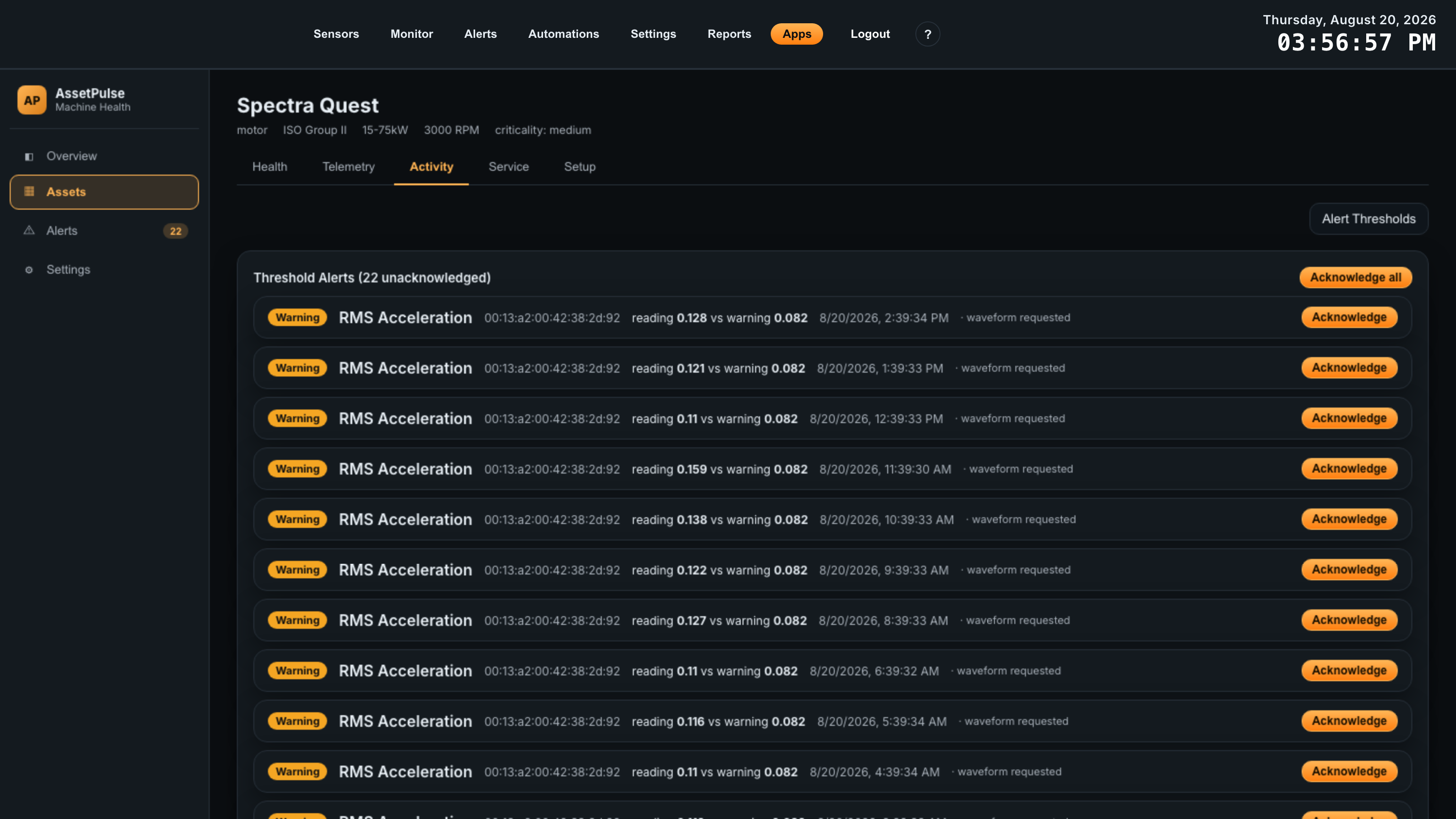
Threshold Alerts is every threshold breach this asset has raised, unacknowledged first, with the count of open ones in the heading. Each row names the metric and the monitoring point, states the reading against the limit it crossed (reading 0.126 vs warning 0.082), and timestamps it. Tags on the row record what the breach triggered — waveform requested, emailed. Acknowledge clears one row from the open count and Acknowledge all clears the backlog; the asset keeps its raised status until every open alert is acknowledged. A row marked timed out was never acknowledged within the re-arm window, so a continuing breach raised a fresh alert instead of staying silent behind the old one.
Notification History is the fault emails actually sent for this asset — time, severity, monitoring point, subject line and recipients. It answers “was anyone told?” without going through a mailbox. Send test sends a test notification using the current configuration and real report content, which is the quickest way to prove SMTP and the recipient list work before you need them; the gear button opens Notification Configuration for this asset.
4. Service
The Service tab is the machine’s maintenance record — and it does one thing no other tab does: adding a service report is what stops repeat fault emails after you have fixed the machine. If you read only one paragraph about this tab, read the next one.
Why notifications go quiet, in plain terms
A machine with a real fault produces a high severity on every capture, for days or weeks. Emailing each one would be useless, so AssetPulse remembers the highest severity it has already emailed you about for this asset, and does not email again for anything at or below that level. One fault, one email.
Only three things break that silence:
- It gets worse. A capture that scores higher than the level already reported — and crosses another of the severity levels you asked to be told about — sends a new email.
- You add a service report. The remembered level is reset, so the very next qualifying capture emails you again. This is the intended way to close the loop.
- The re-arm timeout expires. If a fault is still there and nobody has recorded any work, AssetPulse re-sends after a set period — 48 hours by default — so an ignored fault resurfaces rather than being silenced forever. The period is set with the other notification defaults in Settings, and can be switched off.
So the practical rule: service report after every repair. It is the difference between “no emails because the machine is fine” and “no emails because the app already told us once”.
Adding a service report
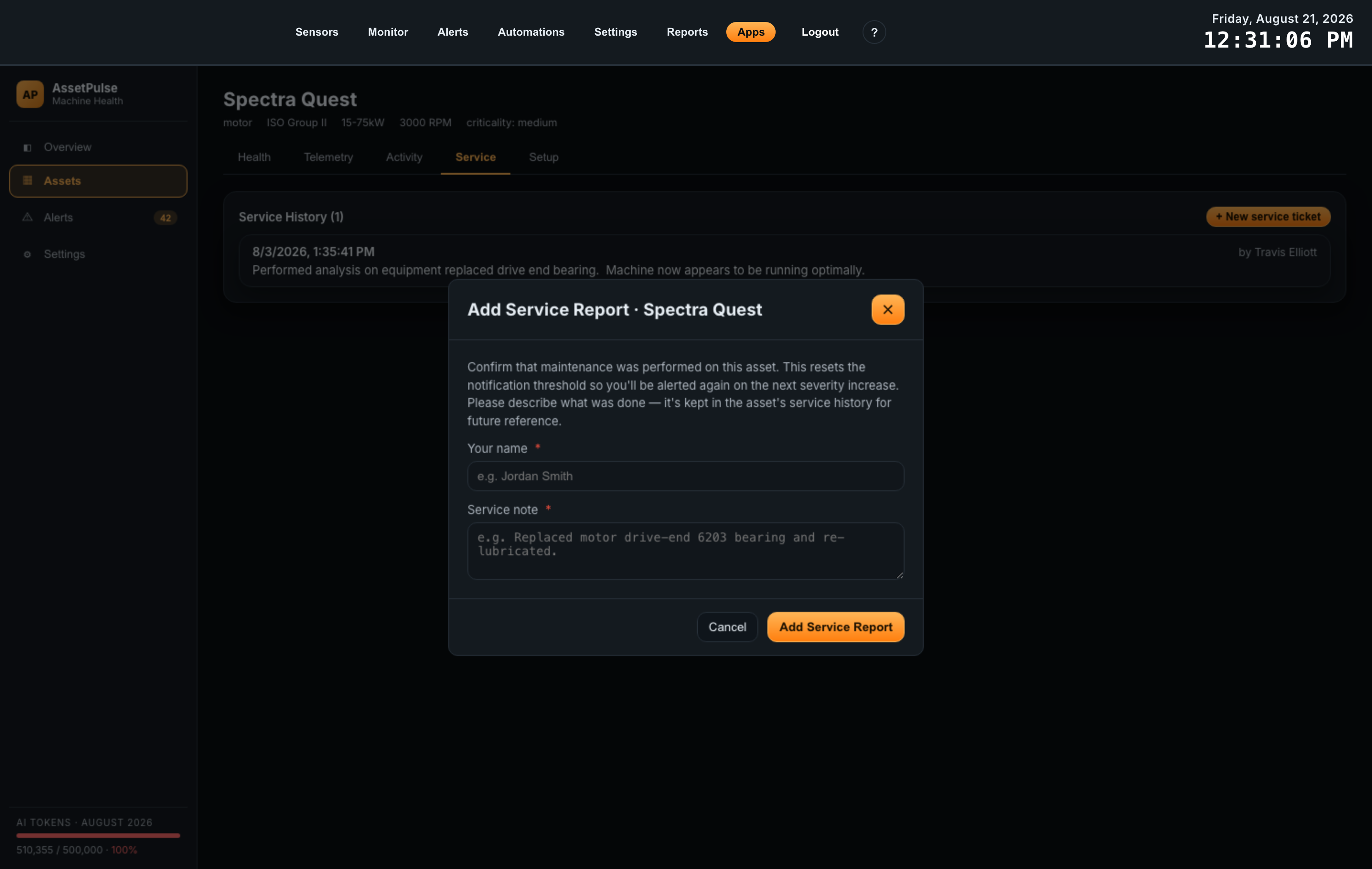
Click + New service ticket. The Add Service Report dialog asks for two things, both required:
| Field | What to put in it |
|---|---|
| Your name | Who did the work. Kept with the entry, so the history says who to ask in six months. |
| Service note | What was actually done — for example Replaced motor drive-end 6203 bearing and re-lubricated. Specific beats brief: this is the text you will be reading against the trend later. |
Add Service Report saves the entry and resets the notification level in the same action; the app confirms with Service confirmed — notifications reset. There is no separate “clear faults” button to remember.
Reading the history
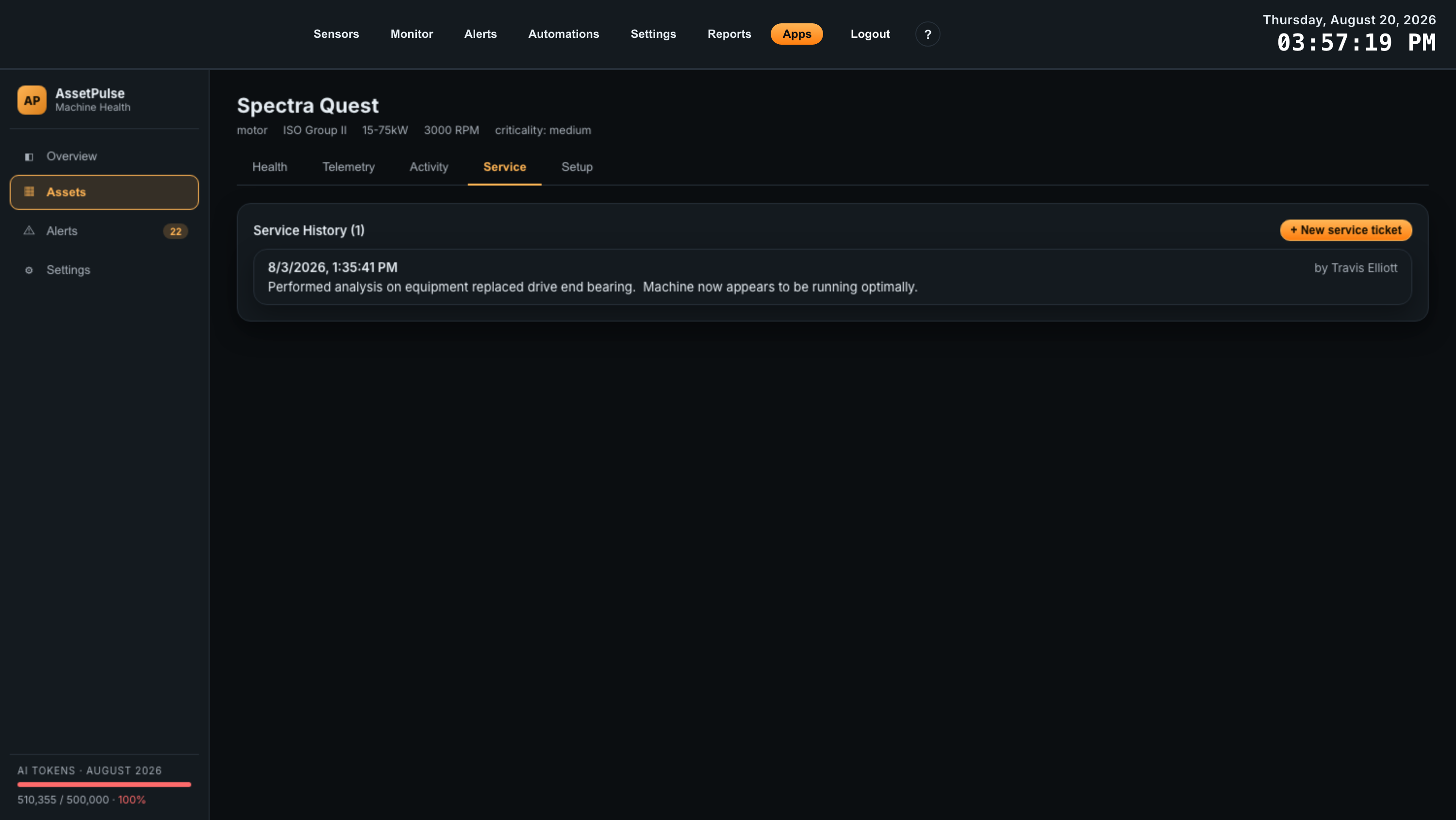
Service History lists entries newest first: when, who, the note, and — where notifications had already fired — the level it reset from, shown as reset from Sev 8. That last detail makes the log a record of what the machine was doing when someone intervened, not just a list of jobs.
Read alongside the Severity Trend, the log is what turns a chart into a story: severity climbing to 8 over two weeks, a bearing replacement, severity back to 3, and a clean baseline for whatever happens next. It is also the honest answer to “did that repair work?” — the trend after the entry says so either way.
5. Setup
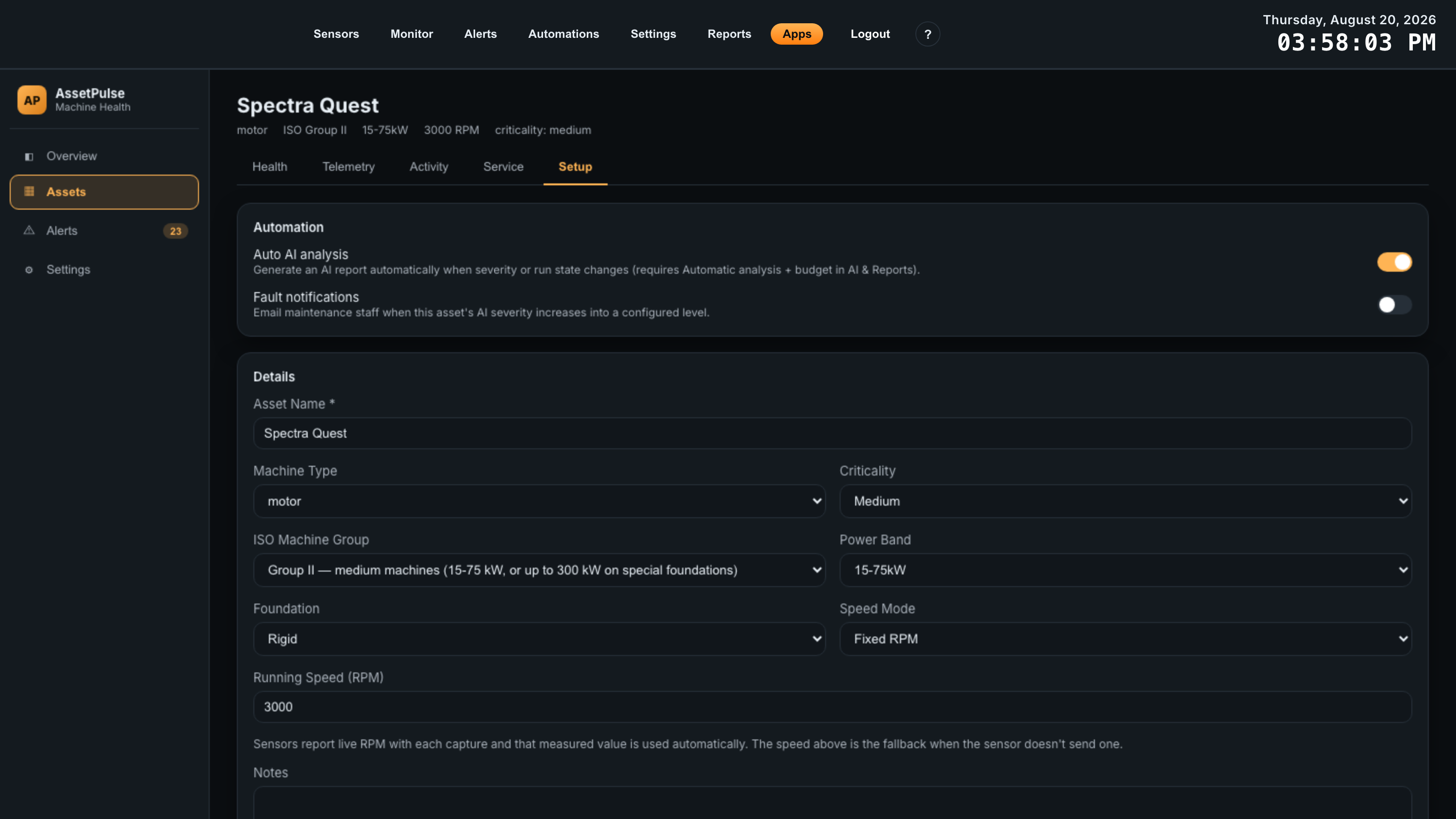
Everything from the Add Asset wizard, editable, plus two per-asset switches at the top.
| Switch | Effect |
|---|---|
| Auto AI analysis | Generate an AI report for this asset automatically when its severity or run state changes, instead of clicking Generate. Requires Automatic analysis and a token budget in Settings — both the gateway-wide switch and this per-asset one must be on. |
| Fault notifications | Email maintenance staff when this asset’s AI severity rises into a level you have chosen. This is the switch the Service tab’s notification behavior applies to. |
Below the switches, Details holds the machine description — the same fields as wizard step 1 — with Reset and Save details. Then Drivetrain and Monitoring Points, each with add, edit and remove controls; a monitoring point row shows its sensor, device ID and mount location, and whether a bearing is set. This is where the detail you skipped in the wizard gets added.
Changes apply to the next capture. Correcting an ISO group or adding a vane count does not re-score captures already recorded, so a trend can legitimately step after an edit — worth a service-log note when it does.
The Danger zone holds Delete asset, which permanently removes the asset along with its components, monitoring points and history. The sensors themselves are untouched and stay available to assign elsewhere.
07Alerts
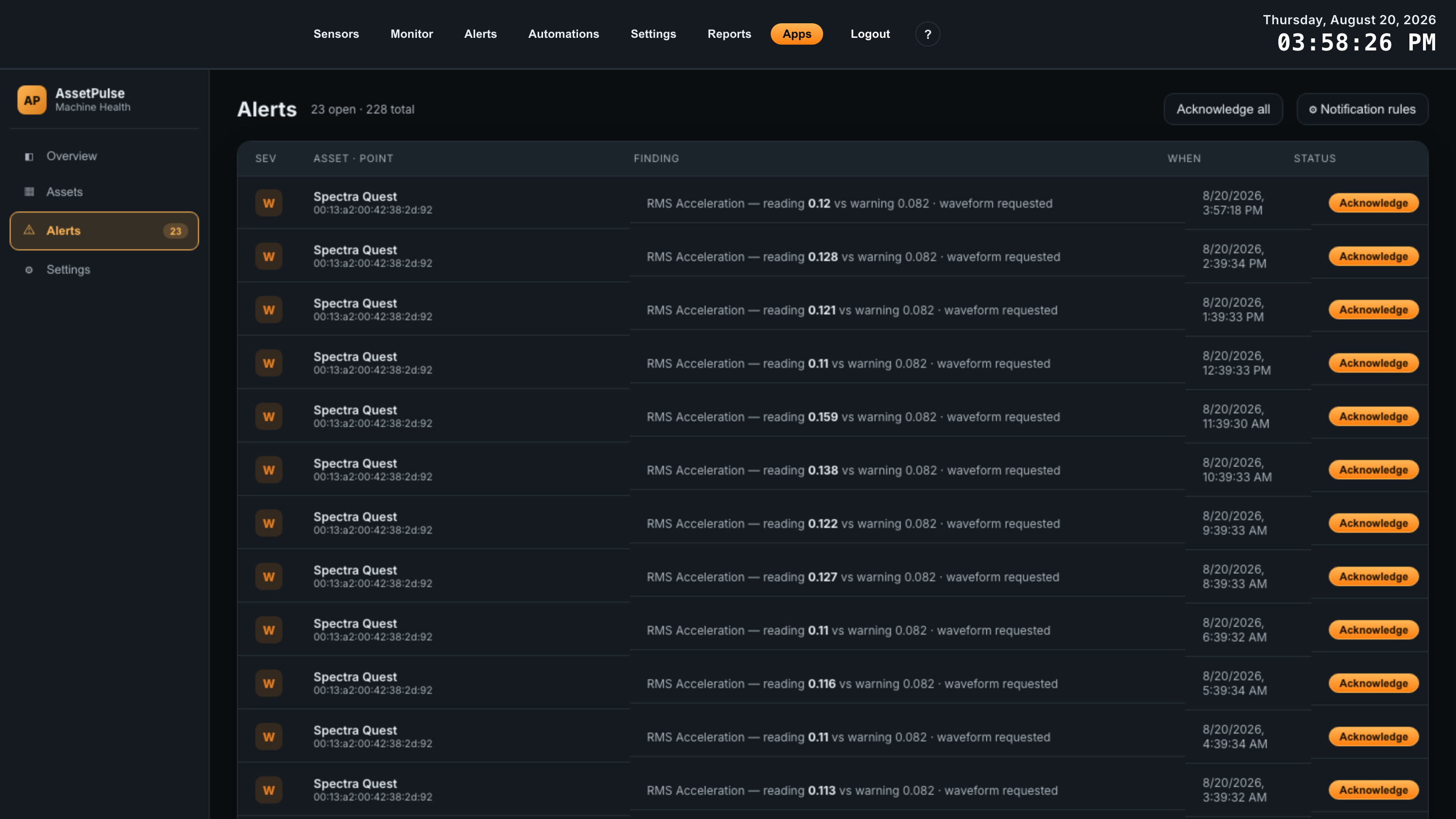
Every threshold crossing across all assets, in one table: severity, the asset and monitoring point, the finding, when it happened, and its status.
A finding reads like RMS Acceleration — reading 0.126 vs warning 0.082 · waveform requested, so you can see both what tripped and what AssetPulse did about it. Acknowledge rows individually, or clear the backlog with Acknowledge all.
Notification rules control who gets emailed and at what severity. Delivery uses the gateway’s SMTP settings, so those must be configured in Atrium’s Settings first.
08AI Reports
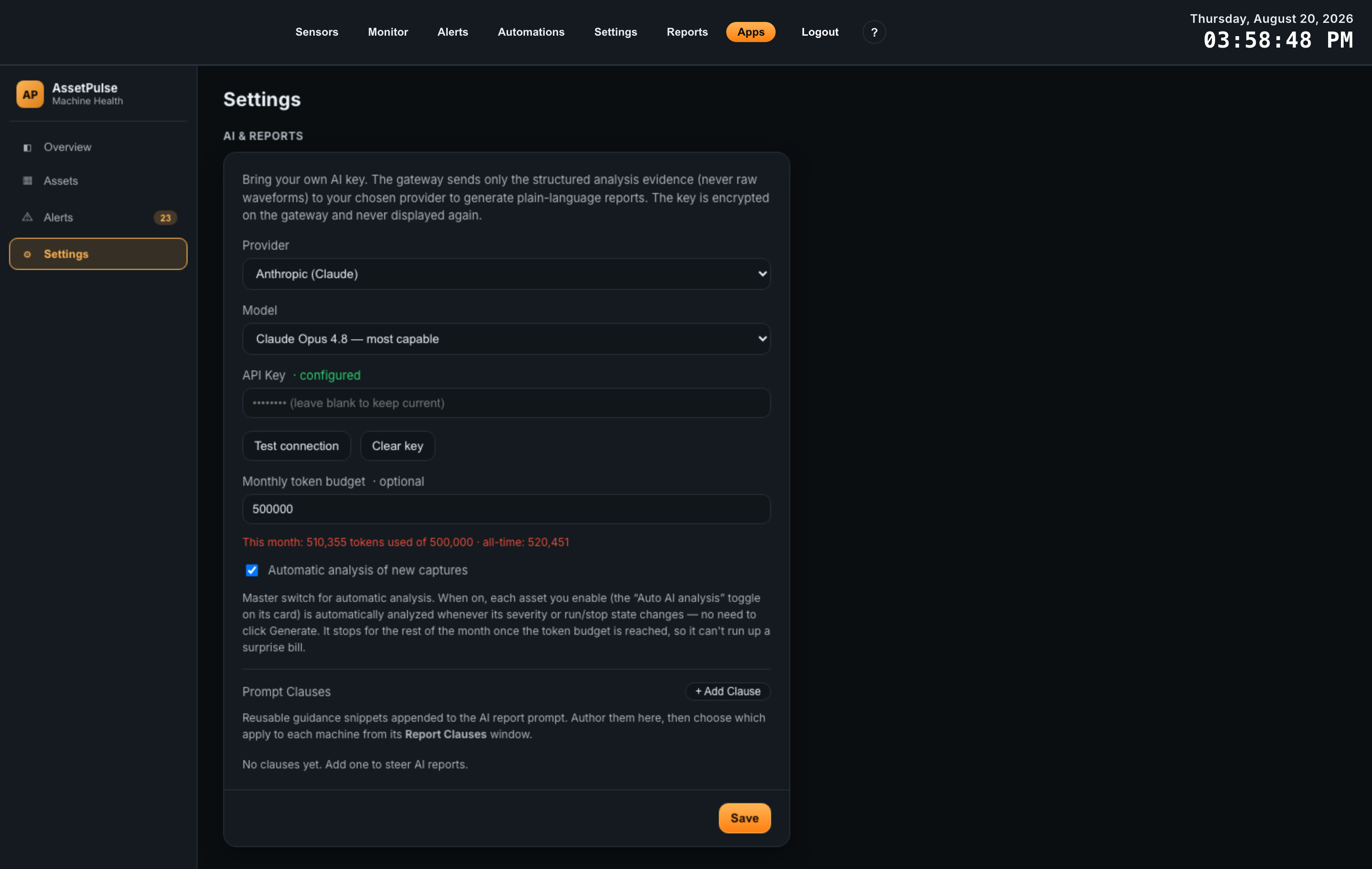
AssetPulse can turn its analysis into a readable report. This is optional — severity grading, trending and alerts all work without it — and it runs on your own AI key.
What gets sent
Only the structured analysis evidence leaves the gateway. Raw waveforms are never sent. Your API key is encrypted on the gateway and is not displayed again after you save it.
Setting it up
| Setting | What it does |
|---|---|
| Provider | Anthropic (Claude) or OpenAI. Support for further providers is coming. |
| Model | The provider’s default, or a model you name yourself. |
| API Key | Your key. Test connection confirms it works. |
| Monthly token budget | Optional but recommended — see below. |
| Automatic analysis of new captures | Master switch. With it on, each asset that has its own Auto AI analysis toggle enabled is analyzed whenever its severity or run state changes, with no need to click Generate. |
| Prompt Clauses | Standing instructions added to every report request — house terminology, what to always mention, what to leave out. |
Reports can also be generated on demand from an asset’s Health tab with Generate AI report, regardless of whether automatic analysis is on.
09Automations
AssetPulse plugs into Atrium’s Automations tab, so machine health can drive actions elsewhere on the gateway — including in other apps.
Events it publishes
- Asset health changed — an asset’s health moved.
- Metric crossed a threshold — a monitoring point crossed a Warning or Critical line.
Actions it provides
- Capture a vibration waveform — request a raw capture on demand.
- Acknowledge threshold alerts
- Send asset health email
A common pairing is AssetPulse: metric crossed a threshold as the When, and a relay action from the ProXR Control app as the Then — so a machine trending badly can be stopped automatically. Because an automation also runs when its condition stops matching, the relay can be switched back without either app knowing about the other.
10Troubleshooting
| Symptom | Cause and fix |
|---|---|
| AssetPulse will not install | It requires Atrium 2.3.1 or newer and an EG5120. The App Center reports which requirement is unmet. |
| An asset shows no severity | No capture has arrived yet. Confirm the sensor is reporting on Atrium’s Sensors page, and that it is assigned to a monitoring point on this asset. |
| Defect indications name the wrong axis | The sensor axis orientation does not match the physical mounting. Correct it on the monitoring point in the Setup tab. |
| Bearing findings look approximate | Only ball count and geometry were supplied. Enter the bearing part number and use Look up for exact defect frequencies. |
| No AI report is generated automatically | Three things must all be true: a monthly token budget is set, Automatic analysis is on in Settings, and the asset’s own Auto AI analysis toggle is enabled. |
| Automatic analysis stopped mid-month | The monthly token budget was reached. It resumes next month, or raise the budget. |
| Alert emails never arrive | Delivery uses the gateway’s SMTP settings. Configure and test them in Atrium’s Settings › Notifications. |
| Severity is high but the machine seems fine | Check the asset’s ISO group, power band and foundation. Grading depends on machine class, so a misdescribed machine is graded against the wrong yardstick. |
11Reference
Severity scale
Severity runs from 1 to 10, where 1 means no issue is evident and 10 means the machine is almost certainly damaged. It is an AssetPulse scale, not a published standard — do not read it as an ISO value.
ISO zones
Measured Velocity RMS is separately placed in an ISO zone for the machine’s class, following ISO 10816 / 20816. This is the standardised part of the assessment, and it is why machine group, power band and foundation matter.
Mount locations
drive end, non drive end, inboard, outboard, casing, other.
Axis orientations
Radial-Horizontal, Radial-Vertical, Axial, Tangential — assigned per sensor axis.
Machine types
motor, pump, fan, gearbox, compressor, blower, other.