Let’s look at some practical examples of how one should interpret measurement data from the Smart Standalone Vibration Sensor Gen4.
There is a great article on it already Gen4: Understanding Data Transmission in Smart Mode created by NCD’s Eduardo M. that some of the parameters mean and give some useful examples.
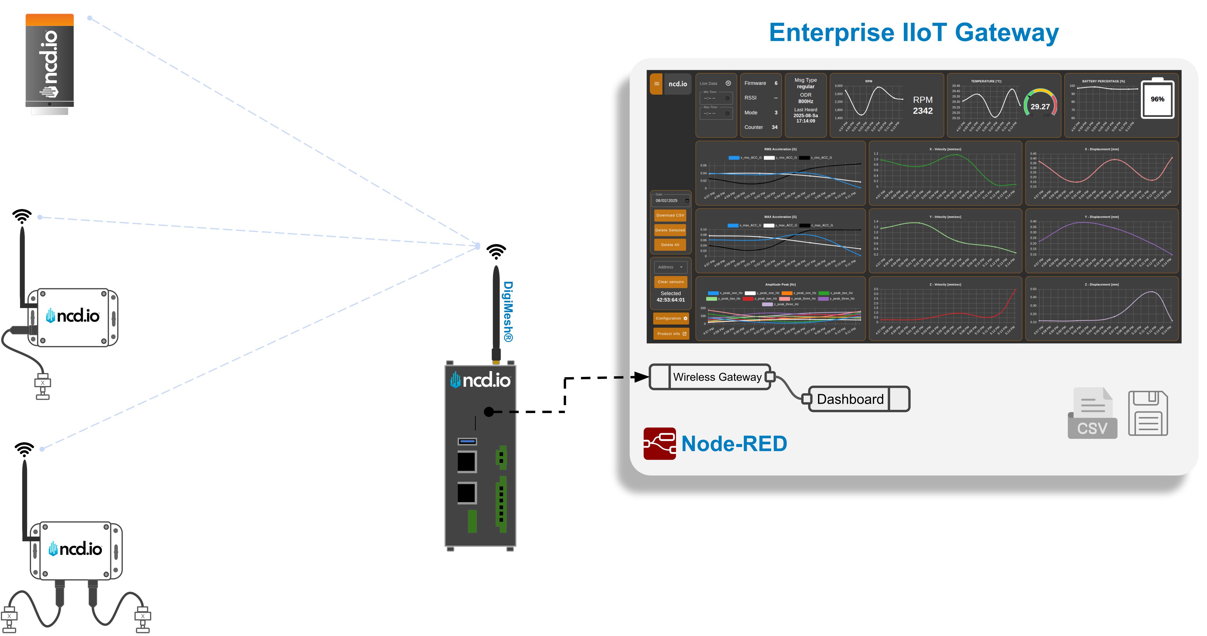
In addition there is an awesome article on how to create an incredibly useful dashboard where you can observe data in real time from the same author – Gen4: Vibration Sensor Node-RED Dashboard. This is very useful, I would say essential if you want to have a well organized and easy to observe panel where all the measurement data is presented in a graph form.
I would suggеst anyone that is starting with the Gen4 to first go through the Quick Start Guide and Manual to begin with and move to the 2 aforementioned articles in order to properly set up and observe measurement data from the sensor.
Once this has been done we can start looking at some example data, which is what this article is aimed at, namely interpreting the metrics.
Main Sensor Attributes and Benefits
The key benefits of this device that also separate it from the Gen4 are the following.
Always on Vibration Monitoring
The sensor samples vibration data all the time. This is a huge benefit as it allows it to basically keep track of vibration levels continuously. Now, this does not mean it transmits this data all the time, draining the battery, it observes but does not act unless needed and this is the key to this device being a predictive maintenance powerhouse.
Machine Learning Smart Mode
This new mode (the Gen3 devices did not have it) relies on machine learning where the sensor intelligently gathers data and learns based on observation. In short you can set threshold levels that when crossed would trigger a response. The sensor will, in this case, send the measurement data and if need be the RAW data (entire time domain sample set of the measurement that crossed the threshold) over the wireless network, making sure that you are notified of the potential fault in your rotational machinery.
A Self-contained, Cloud-independent Smart Edge device
The machine learning capabilities are built in, you don’t need Cloud connectivity, no functionality is locked behind a subscription pay wall. You own your data and can do with it what you need to ( especially useful for a detailed frequency domain analysis of the RAW time domain data, which will be talked about in a follow up article).
The test setup
In order to give credibility to this content and also to have some actual vibration data we are going to use s small mockup setup that represents a real scenario.
It consists of a small engine that has enhanced with a mechanism that allows us to load it with an eccentric load in order to force it to go outside of its normal operational ranges as far as vibrations go.
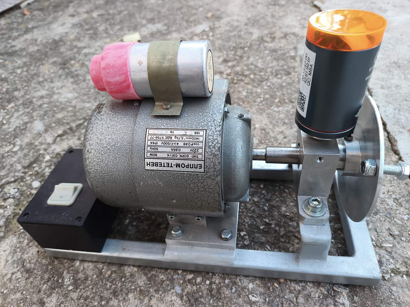
There is a disk that is used to load the motor, this is used as the baseline.
When a small bold is mounted on the disc it acts as the eccentric load, forcing increased vibrations simulating potential faults (these will be discussed in the article).
Reading and Understanding the Measurement Data
OK, you have your sensor and it is outputting data, so how do you interpret this info, what does it mean and what would be some best practices to apply in order to better understand the performance of your rotational machinery.
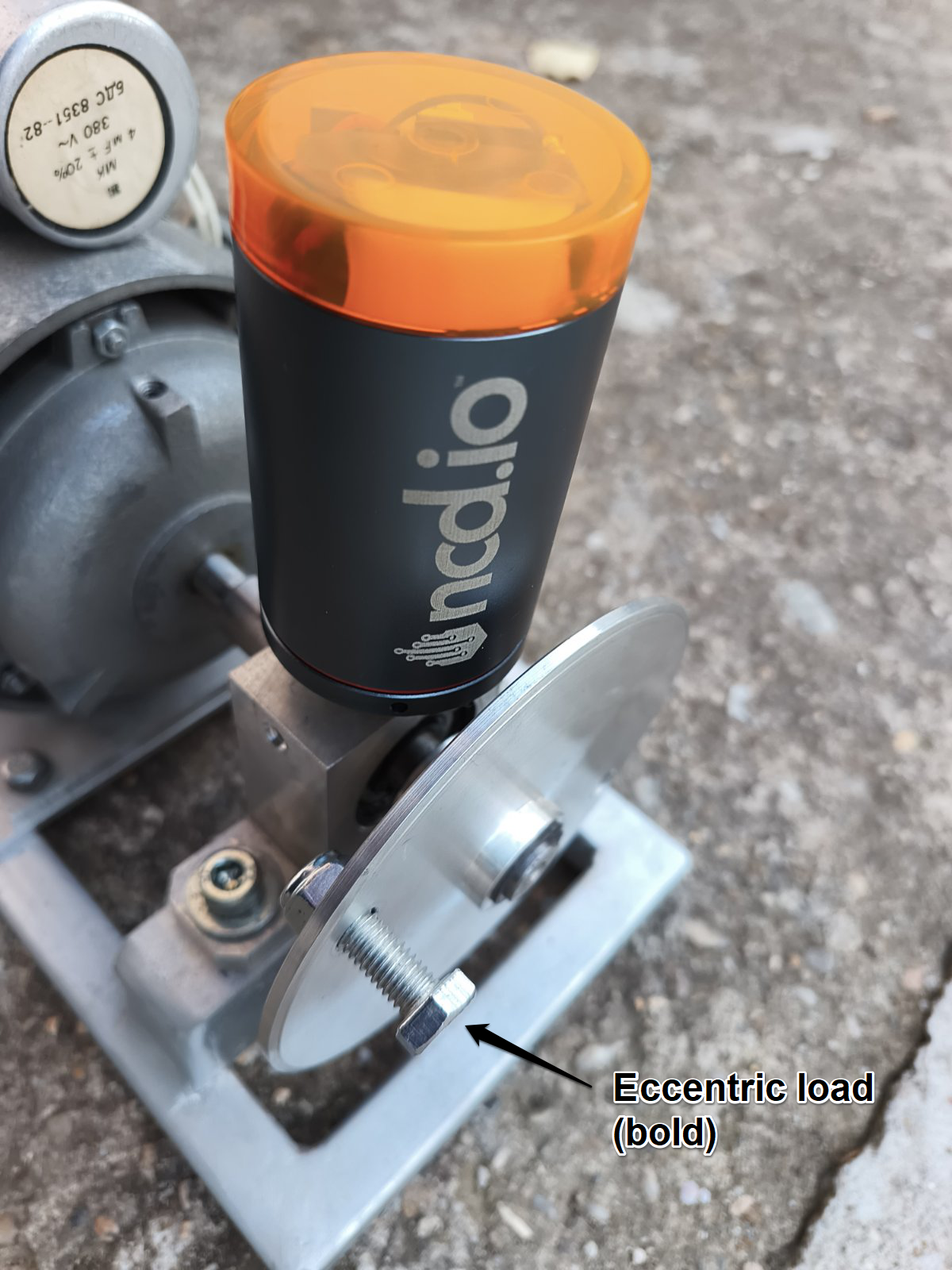
For the purpose of this short explanatory article we are going to use a small test setup, which consists of an electric motor that has its rotor connected to a shaft that has been designed in such a way that a counter weight can be introduced to it. This will simulate potential faults as it will cause it to be out of balance resulting in what would be essentially behaviour similar to what a machine would experience if there was misalignment. Additionally as the motor is not bolted to the ground and is quite light this additional vibration will also cause it to shift, making it look like it is experiencing displacement.
By introducing this adjustment to the setup, purposefully, we will be able to simulate the aforementioned 2 types of faults and show how these can be identified by looking at the data in the dashboard.
Start by establishing a baseline
This is very important as you need to determine what would be the baseline vibration level to use to compare to. Mount your sensor and take a few readings till you have a stable curve. Take a look at the example below.
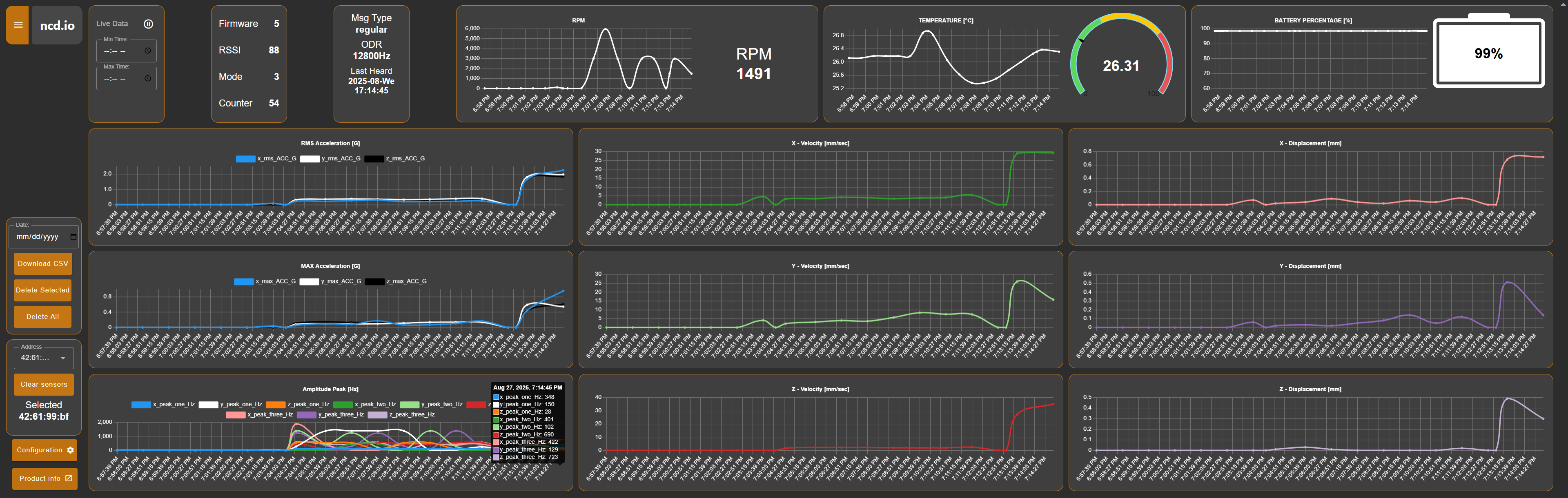
You can clearly see in each of the graphs where the vibration curves started having nonzero values, this is when the motor was actually turned on. This is observable over all axes and is reflected in the acceleration, velocity and displacement graphs. If you check on the Amplitude graph where the frequency components of the vibration signal with the highest levels are displayed you will see that 9 components appear (3 per axis), indicating that we do have valid measurements.
Our example setup is in no means ideal, the device is not brand new and there are irregularities and faults in its components as they have taken some wear and tear. This is fine as it will more or less be the case in any real environment, the point here is to have a baseline to compare to in order to be able to identify worsening performance.
Examine the actual values in the period where the irregularities happened
The time plots are very useful for determining whether or not there is a potential fault, based on how much of an increase from baseline levels we are observing. They can alert one in time that there is a problem and to some degree how severe it is. They can’t however give deeper insights into what type of a problem it is, which component might be the one to be causing the issue.
In order for this insight to be extracted one need look away from the time based measurement and into the frequency domain of the vibrational components our sensor is outputting.
Thus, we can look at the “Amplitude Peak” graph where we see the frequencies where the highest energy vibrations have been measured. There is a direct correlation between the frequency of the component and the type of faults that is causing it (detailed info can be found in this Article)
To keep things simple, we will use the following image as a loose guideline.
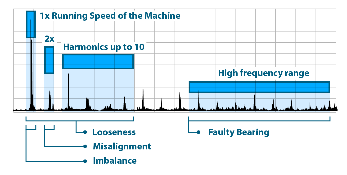
Now taking a look at the frequency components, we can start to make some educated guesses on what caused the increase in vibration (we do know as we introduced it, however in practical conditions this would not be the case).
We will not go into the science of it as this is a practical article, however the following need to be taken into account.

The RPM of the machine under examination – 1400 as per the device label (around 1500 as measured by the Vibration sensor itself). Using a simple conversion we end up with a main rotation frequency for our motor of around 25Hz
Thus if we look at the data we see a strong component around 28Hz (within the main rotational frequency of the machine). This clearly indicates that (as per the image above), we are dealing with an Imbalance issue of some type. Indeed this is the case as this is precisely what introducing the counter weight we mentioned is, an artificial imbalance.

Let’s look at the higher order frequency components next, we have some at 100, 130, 150. These are in the range from 4 to 6x the main rotational frequency. Again using the image as a rule of thumb, these should indicate we have a looseness issue. Indeed when introducing the counterweight there was a very observable movement of the motor, indicating looseness (this is to be expected as it has not been bolted to the ground on purpose in order to create a very observable loosened fault).

The next set of frequency components starts at around 350, up to 700. These are in the range of 14 to 28x the main rotational frequency. These fall in the high frequency range, which indicates bearing faults. This is again to be expected, as the bearings are being stressed significantly due to the imbalance itself, the entire motor is not working optimally, resulting in more friction and heat, the bearings being one of the main components, naturally taking the damage.
Interestingly enough we do not have components around 2x the frequency around 50Hz, which is actually to be expected as this would mean there is potential misalignment issue, which is not the case as our artificial faults are not one that should cause one.
Establish thresholds
Now that we have an idea of what the normal vibration is and what abnormal conditions are (not necessarily required, however we used it to illustrate how things work), thresholds can be set to automate the process of gathering data. This way we will optimize the process so we only gather data exactly when we need it, which provides us with a nice balance with preserving battery life (as we are not taking unnecessary measurements) and being able to react on time to potential changes in the vibration pattern due to a fault in the equipment.
This depends on your particular use-case and how granular you want to be but a good starting point would be a 10-20% of the baseline vibration. Take this value and set it for the “Smart Mode Threshold” parameter. This will set the sensor in such a way that it will only send if the vibration pics up on any axes to a point where it is at least 10-20% higher than the baseline (this applies to both regular and on demand data).
Additionally you can set the “Acceleration Wake/Interrupt Threshold” to a level that is at the or 5% above the baseline vibration. This will allow the sensor to automatically send a message when the Smart Mode Threshold is exceeded (otherwise a message will only be sent when the regular transmission interval time has elapsed, which might be too late if the fault is serious).